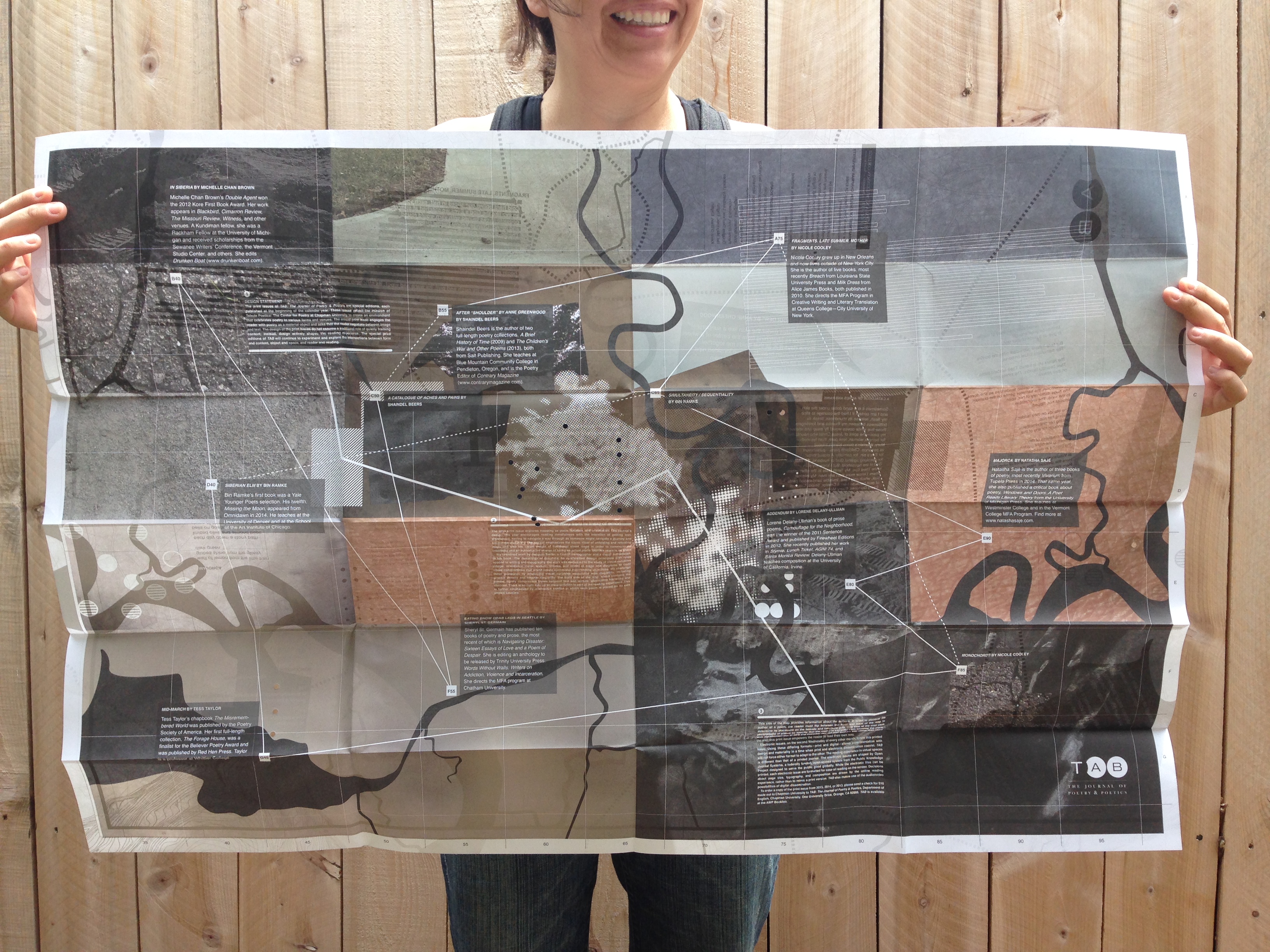
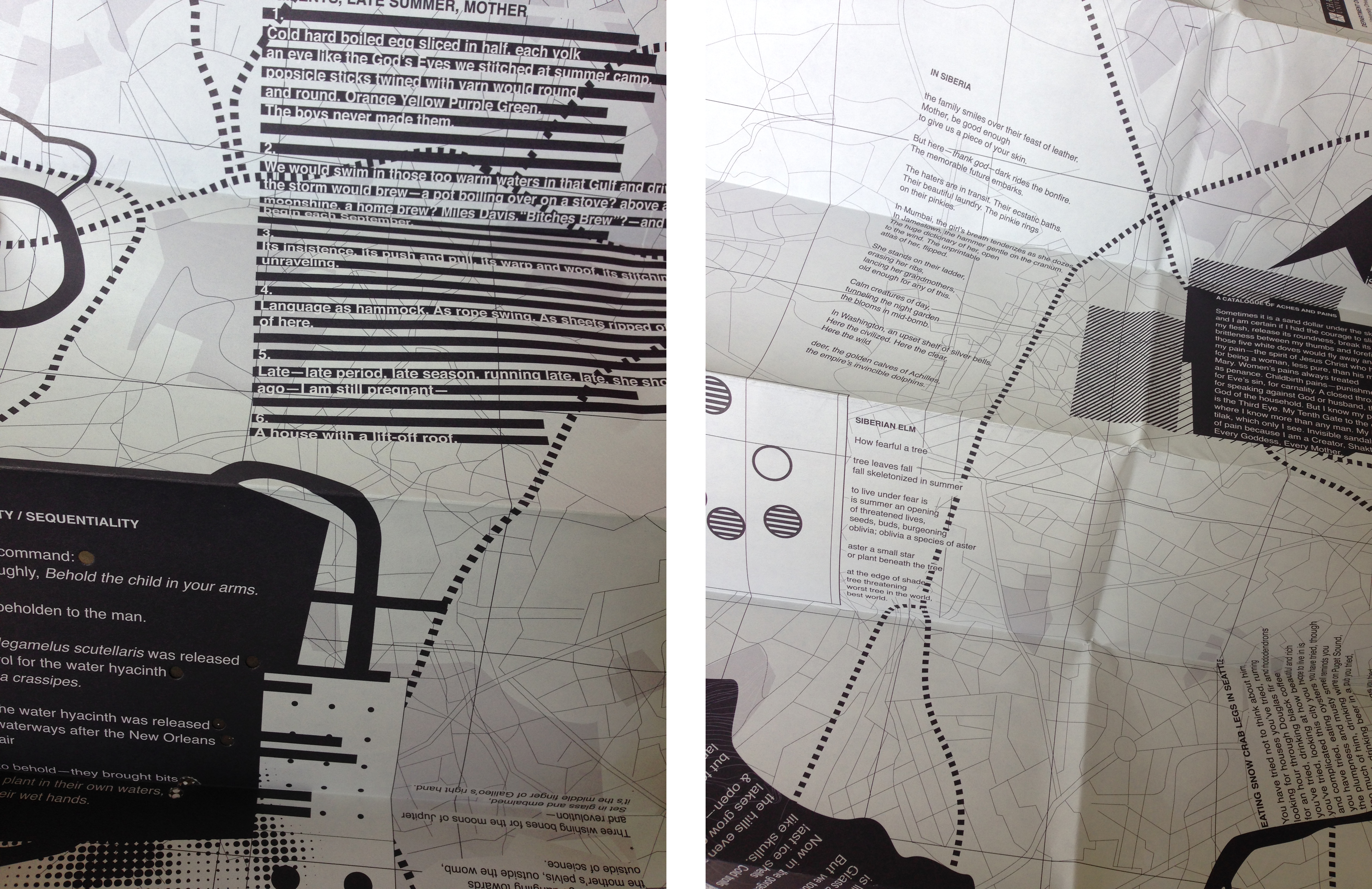
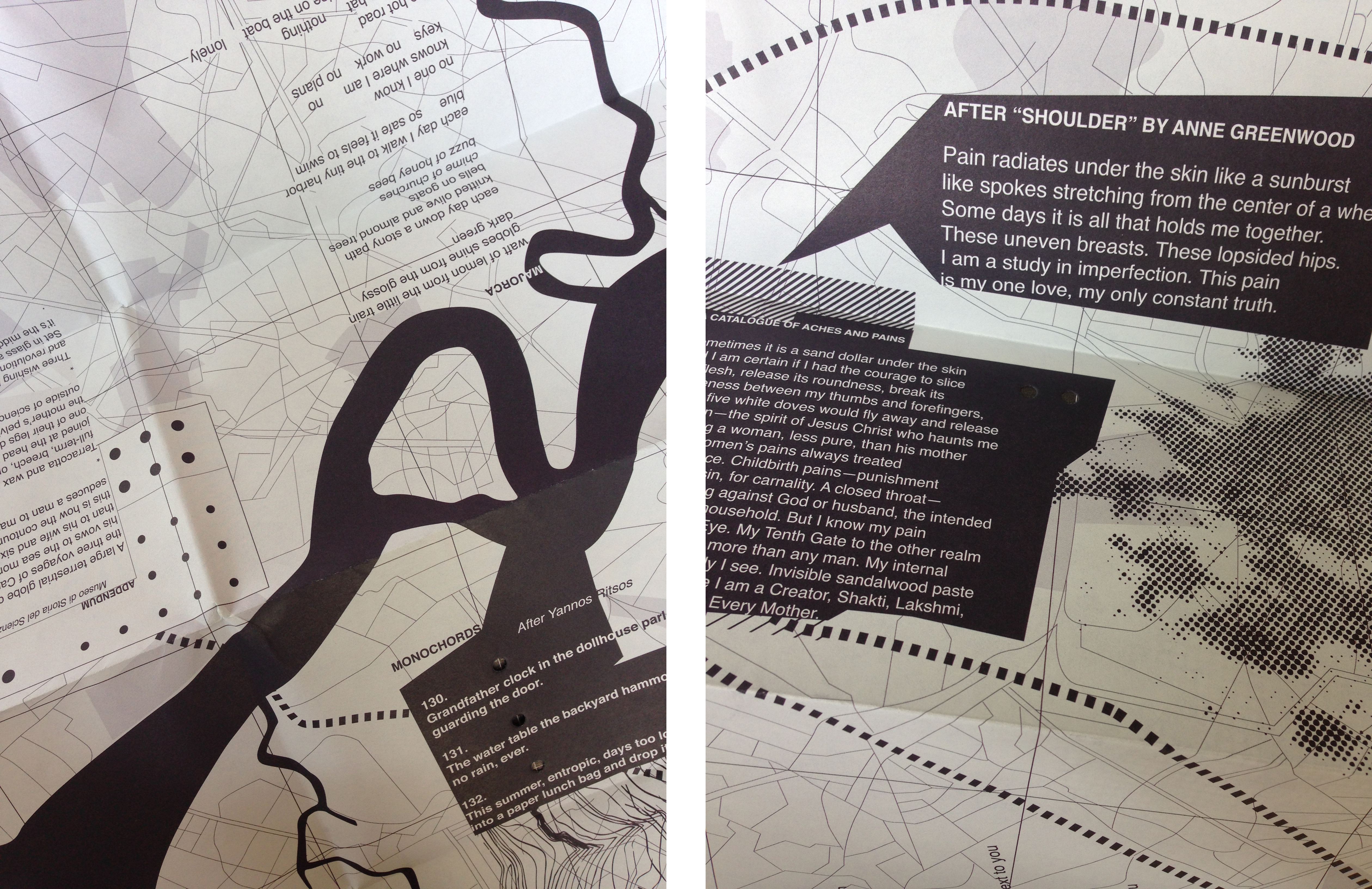
The 2015 print issue explores mapping as place, location, and orientation. The journal’s design this year encourages reading mindfulness with the intention of getting lost, disoriented, having to navigate a way through as someone might navigate a journey and encourage discovery. The journal emphasizes the iconic ritual of unfolding and refolding maps and also the visual weight of traditional street maps in order to communicate credibility and an authoritative source of being an actual place. But this place is no place.
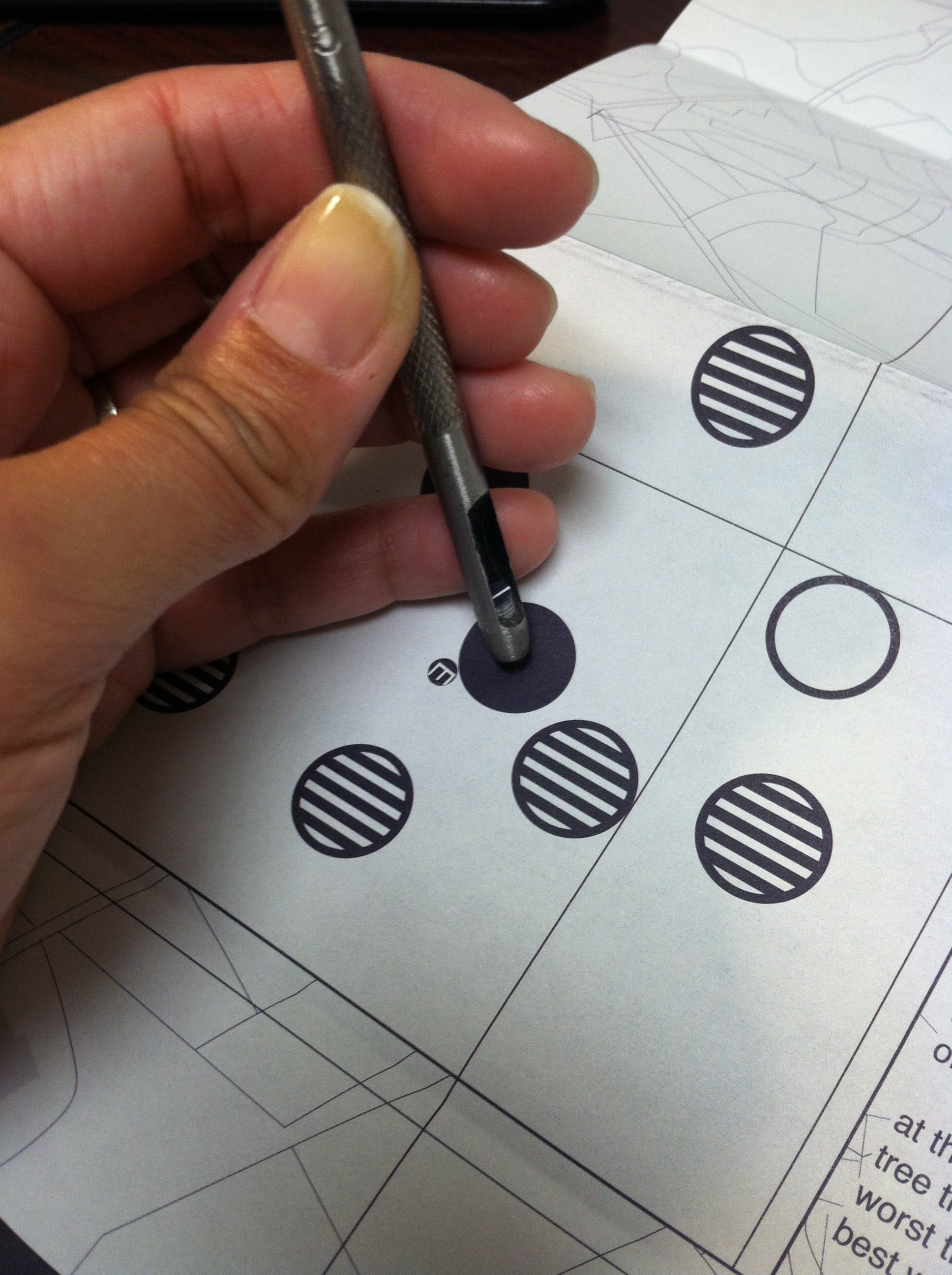
We examined work by Jacques Bertin, a French cartographer and a visual semiotician. In his book, The Semiology of Graphics, he synthesized design principals with rules applied to writing and topography. His work was dedicated to the study of visual variables (shape, orientation, color, texture, volume, and scale) of maps and diagrams to code visual combinations that would create successful map-reading objectives. We challenge these guidelines by employing visual variables associated with illegibility, including graphic density and angular illegibility. The front side of the map, which contains the poems, tightly compresses layers between text and texture, eliminating hierarchy and contrast. There is no right side up so disorientation is part of the reading experience. This is further emphasized by orientation conflict in which each poem is placed on its own angled baseline.

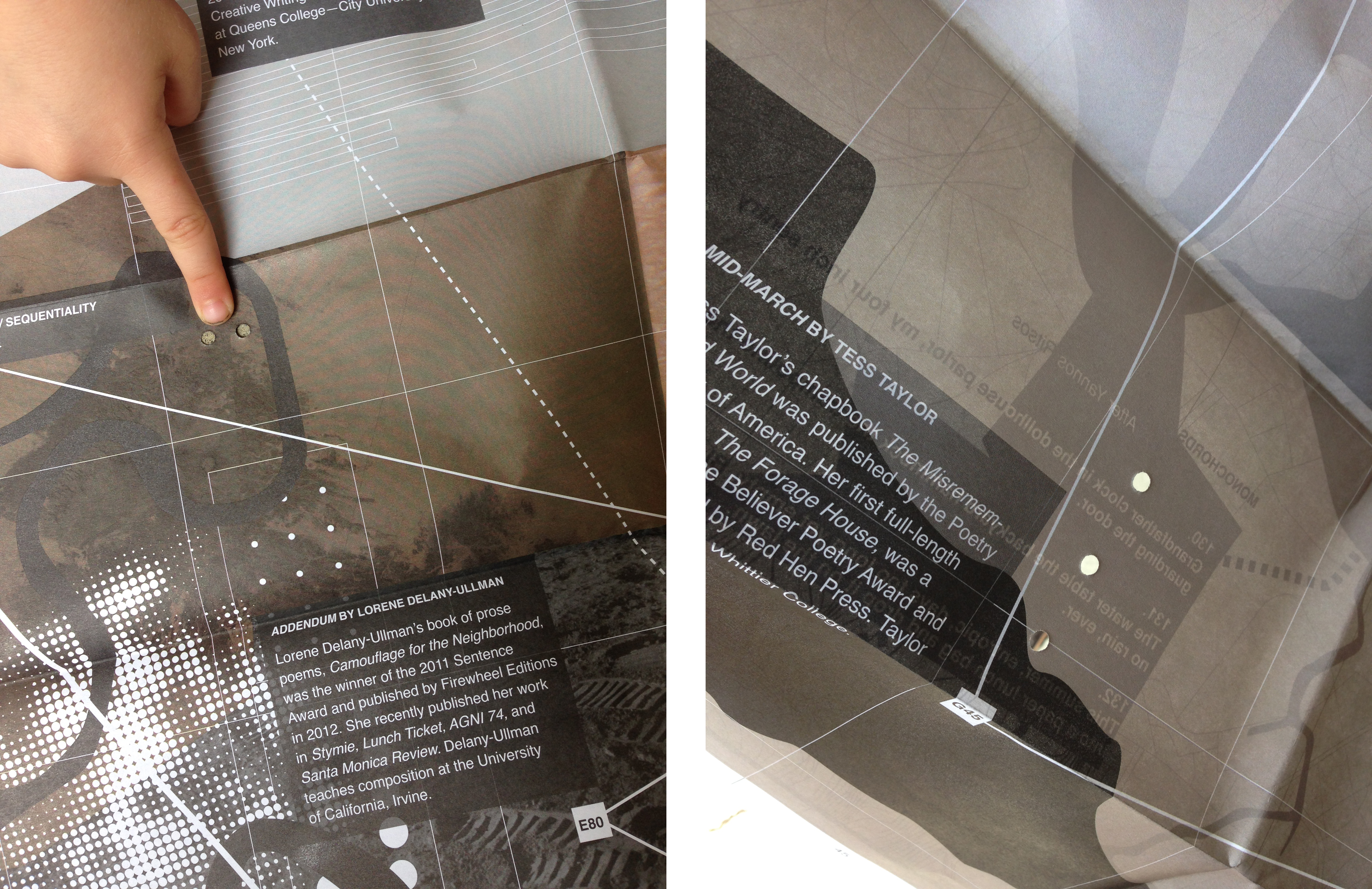
This back side of the map provides information about the authors. In order to discover the author of a poem, the reader must flip between the front and back of the map to determine its placement on the latitude and longitude grid. This side of the map uses photography of places so specific that the reader is excluded from knowing the place. With the common use of GPS and everyday devices that lead the way rather than show the way, this print issue empowers the reader to lead their own way.