I have been the Creative Director for TAB: The Journal of Poetry & Poetics, a national and international journal of creative and critical writing, since 2013. The approach of the collaborative creative process between Dr. Anna Leahy, Editor-in-Chief, has demonstrated true interdisciplinary work and exemplifies play, experimentation, accessibility, and inclusion.
Tab Journal’s mission is to discover, support, and publish the contemporary poetry and writing about poetry; to provide a forum in which the poetic tradition is practiced, extended, challenged, and discussed by emerging and established voices; and to encourage wide appreciation of poetry and expand the audience for poems and writing about poetry.
The print issues of the Tab Journal are special editions, each published at the beginning of the calendar year. These issues reflect Tab Journal’s mission to create an environment that celebrates poetry in various forms and venues. The annual print issue engages the reader with poetry as a material object and asks that the reader negotiate between image and text.
Vol. 13 (2025)
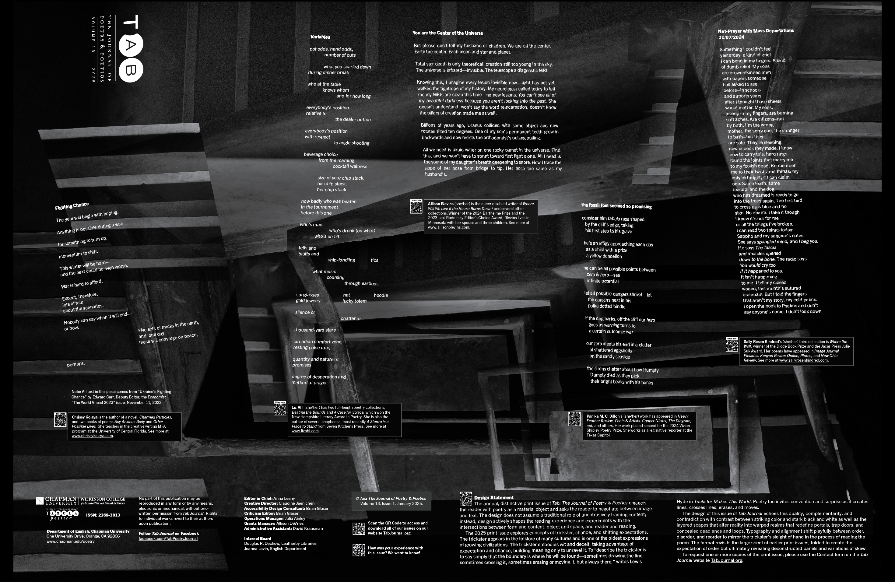
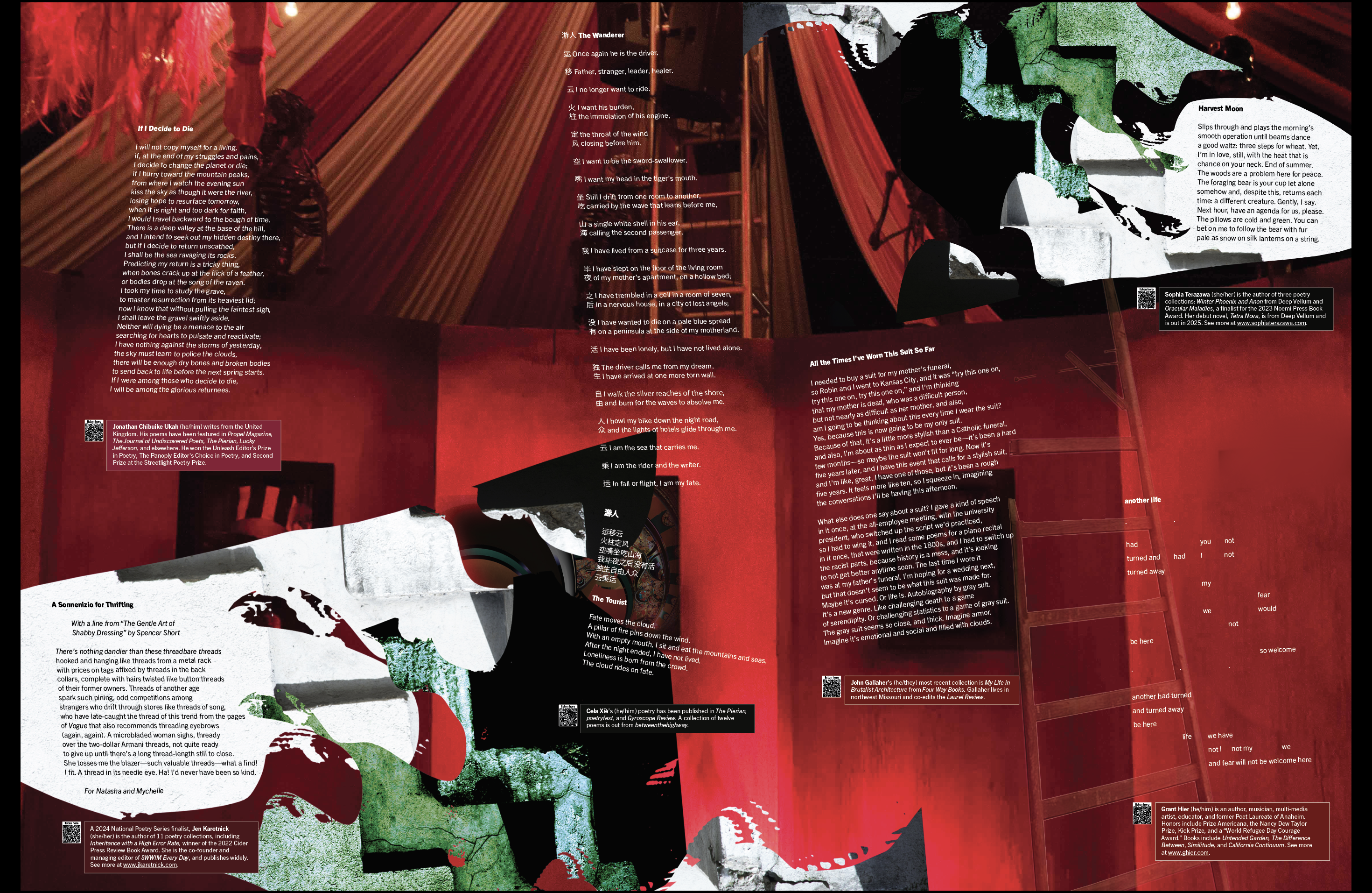
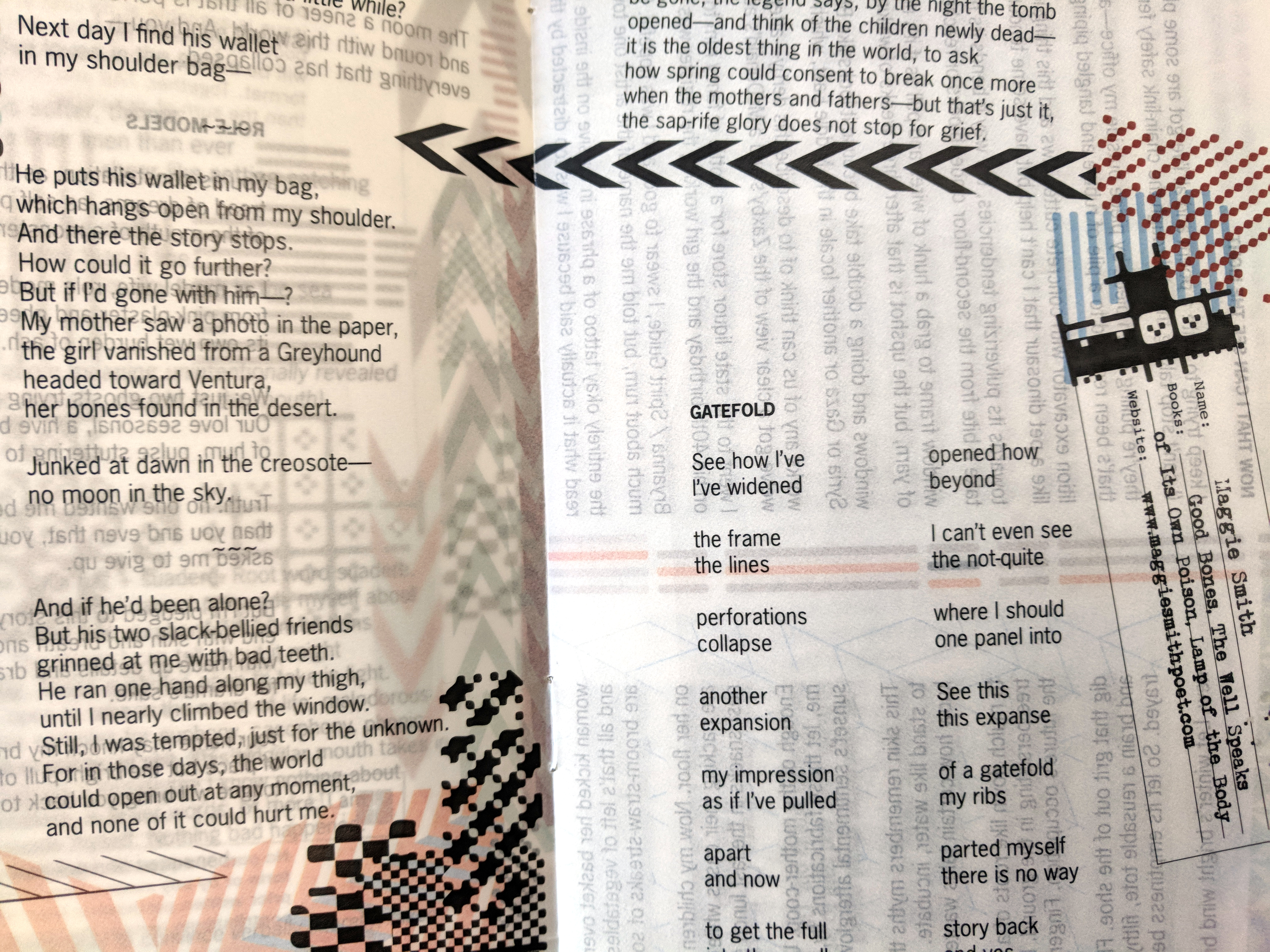
The 2025 print issue explores concepts of trickster, chance, and shifting expectations. The trickster appears in the folklore of many cultures and is one of the oldest expressions of growing civilizations. The trickster embodies wit and deceit, taking advantage of expectation and chance, building meaning only to unravel it. To “describe the trickster is to say simply that the boundary is where he will be found—sometimes drawing the line, sometimes crossing it, sometimes erasing or moving it, but always there,” writes Lewis Hyde in Trickster Makes This World. Poetry, too, invites convention and surprise as it creates lines, crosses lines, erases, and moves.
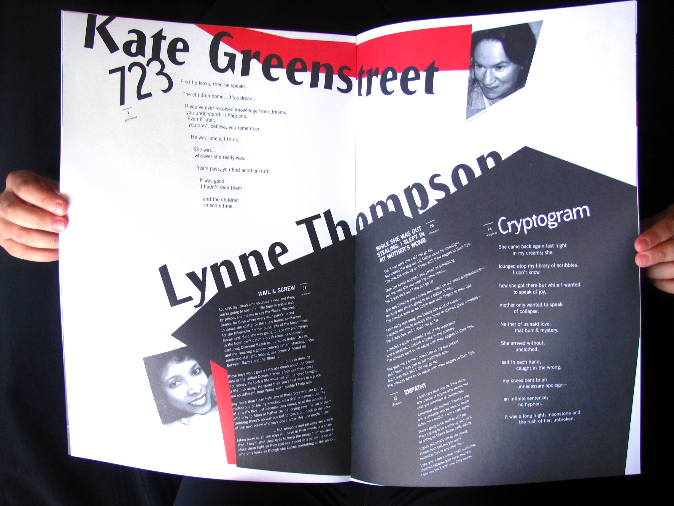
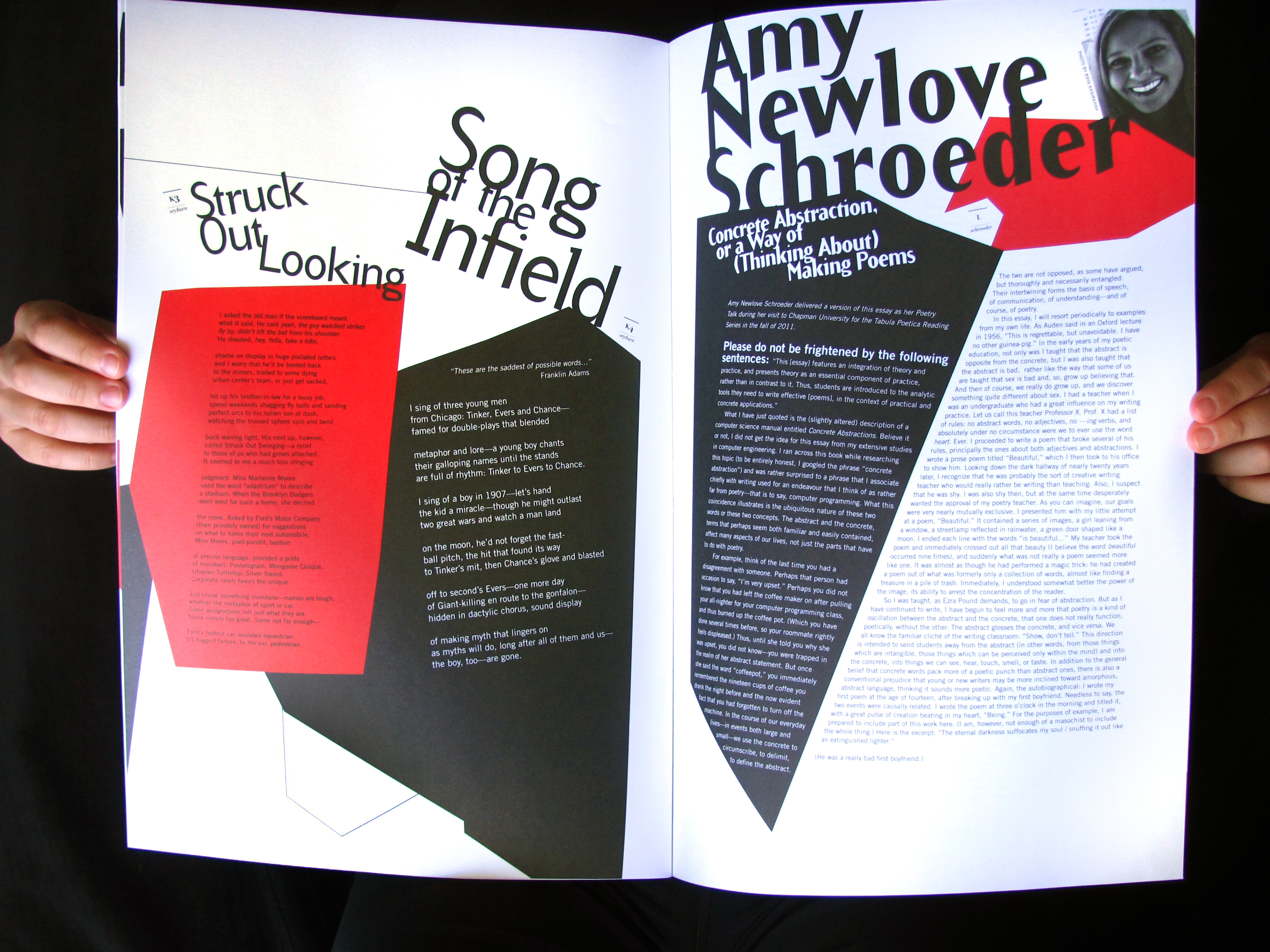
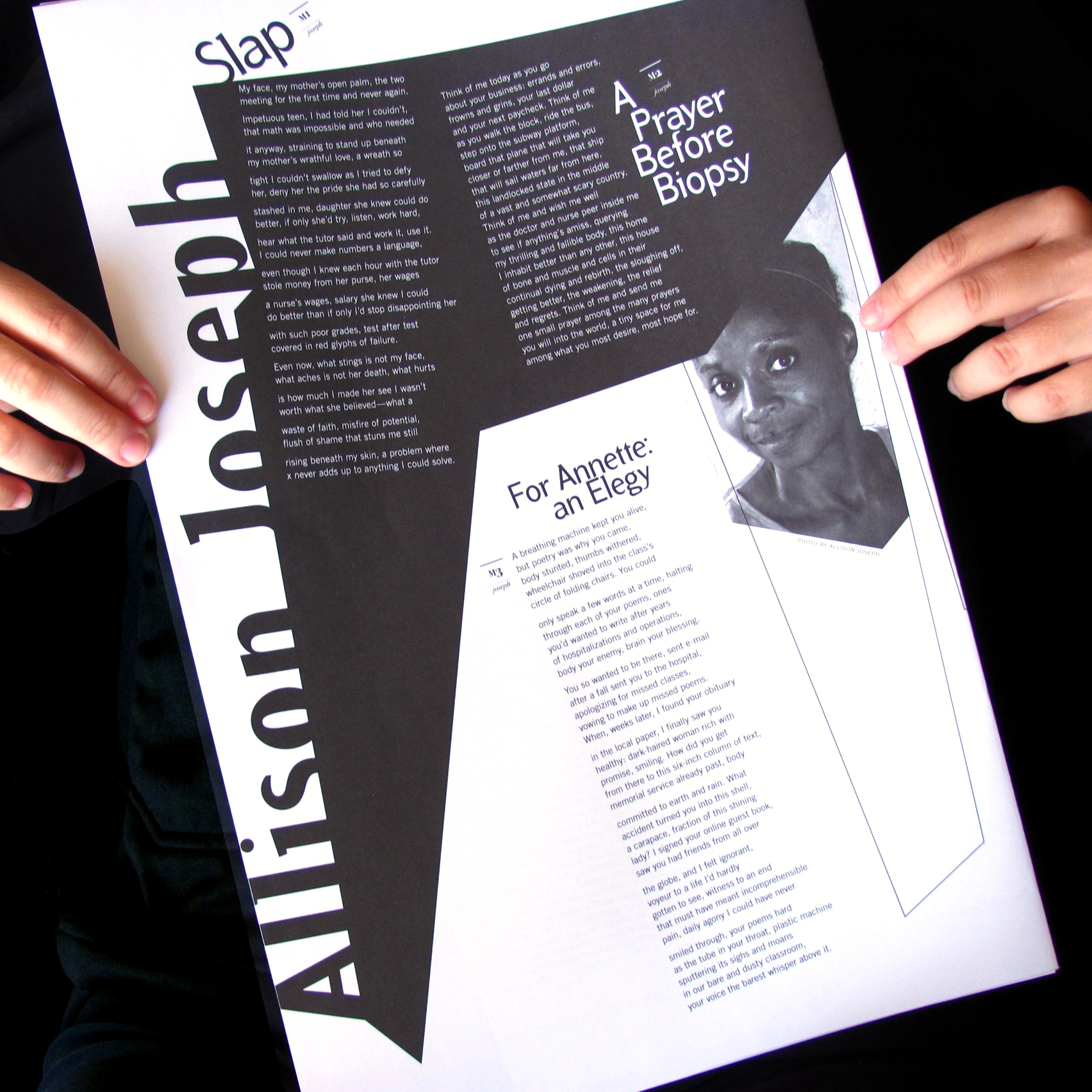
The design of this issue of Tab Journal echoes this duality, complementarity, and contradiction with the contrast between striking color and stark black and white, as well as the layered scapes that alter reality into warped realms that redefine portals, trap doors, and concealed dead ends and loops. Typography and alignment shift playfully between order, disorder, and reorder to mirror the trickster’s sleight of hand in the process of reading the poem. The format revisits the large sheet of earlier print issues, folded to create the expectation of order but ultimately revealing deconstructed panels and variations of skew.
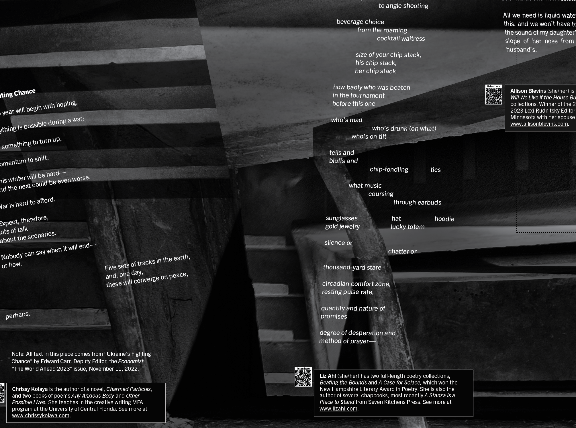
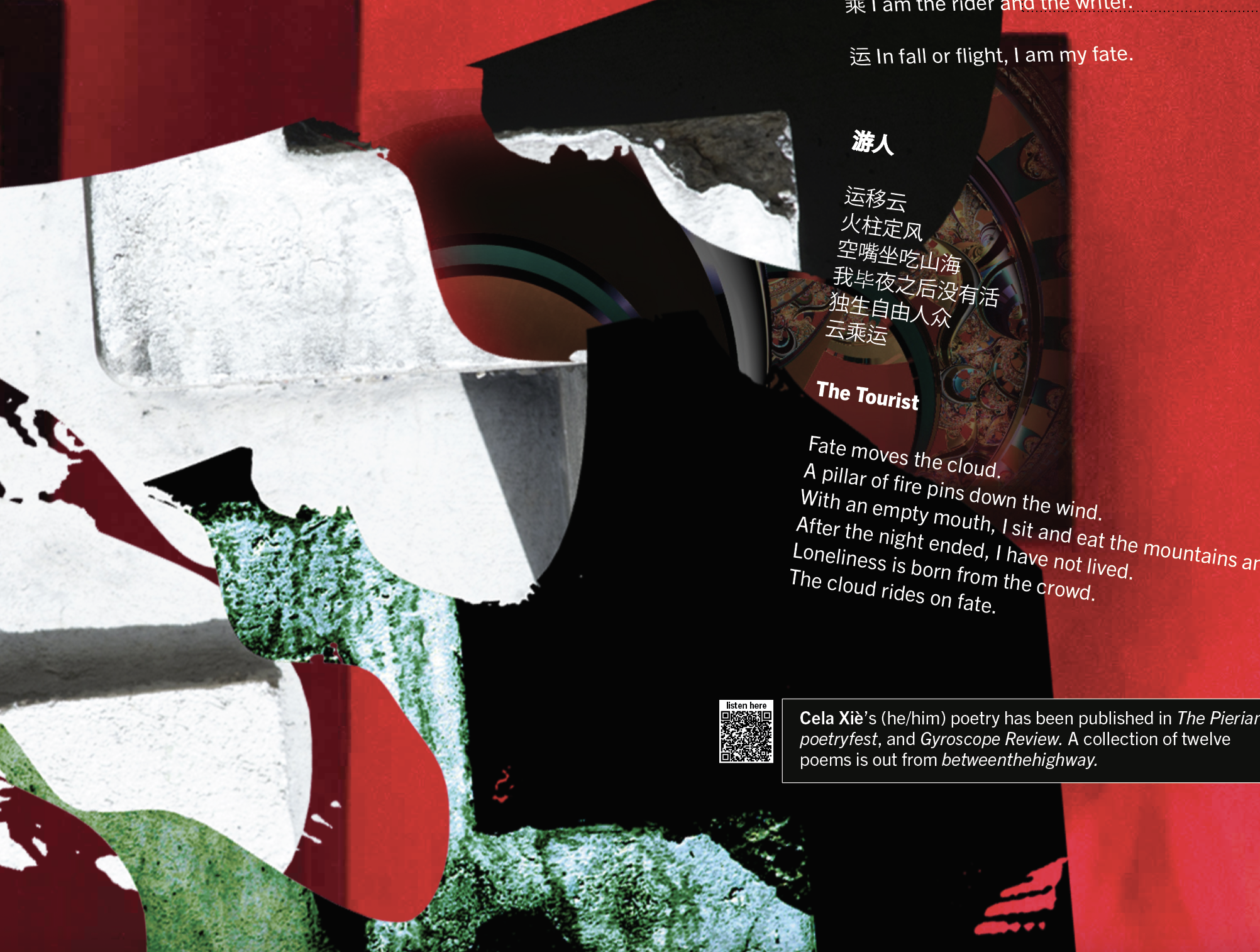
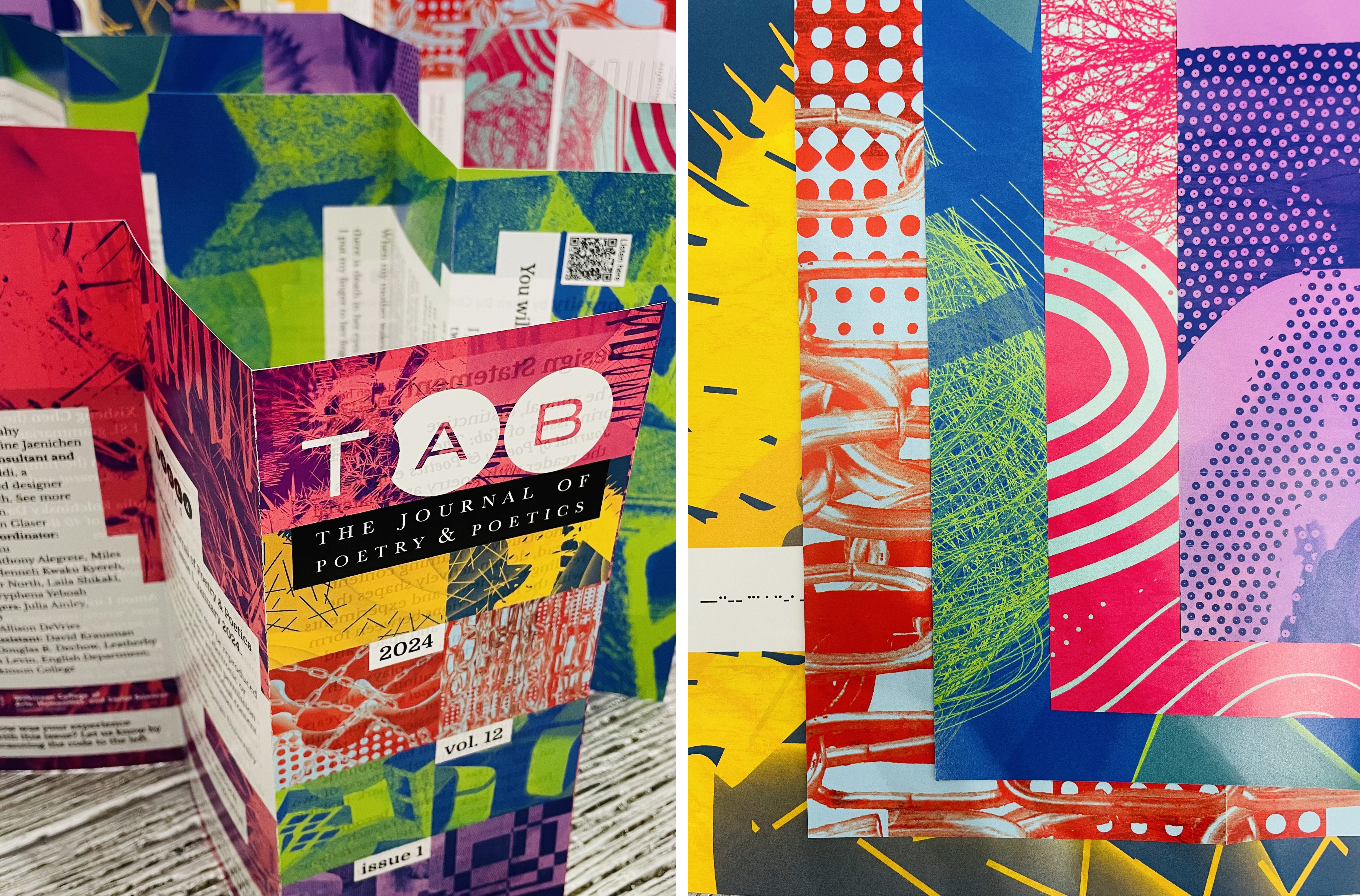
Close details of collage backgrounds:
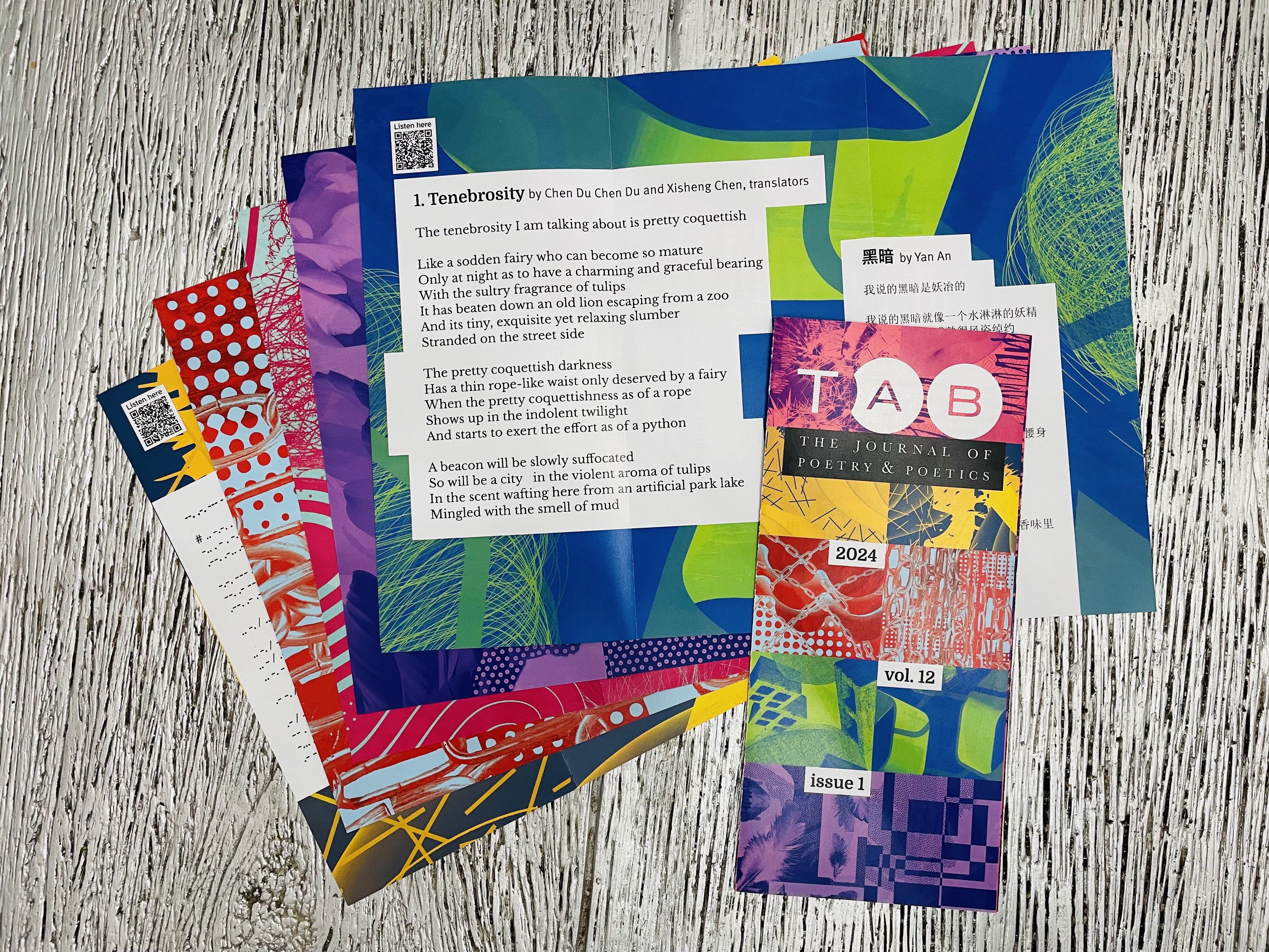
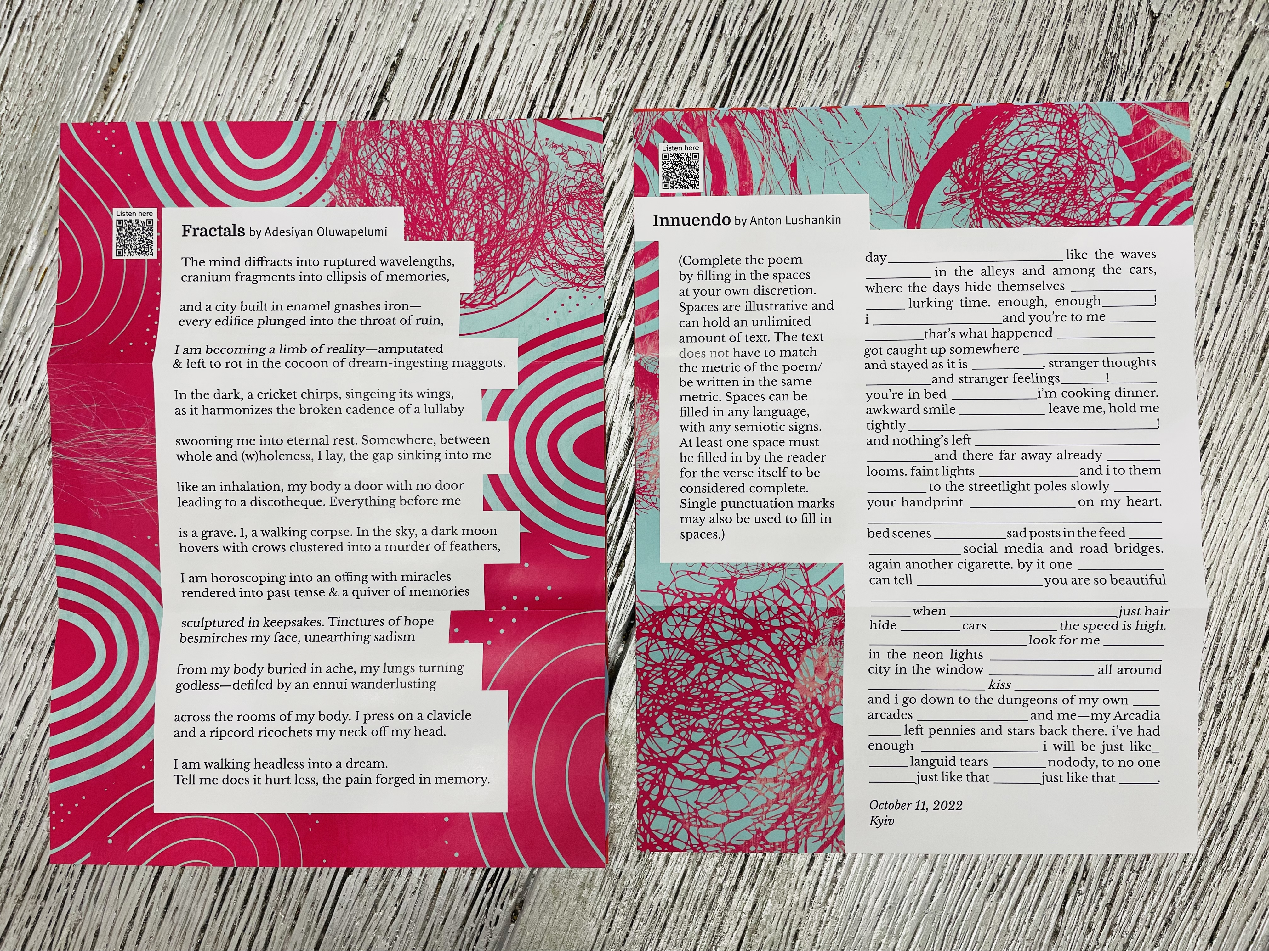
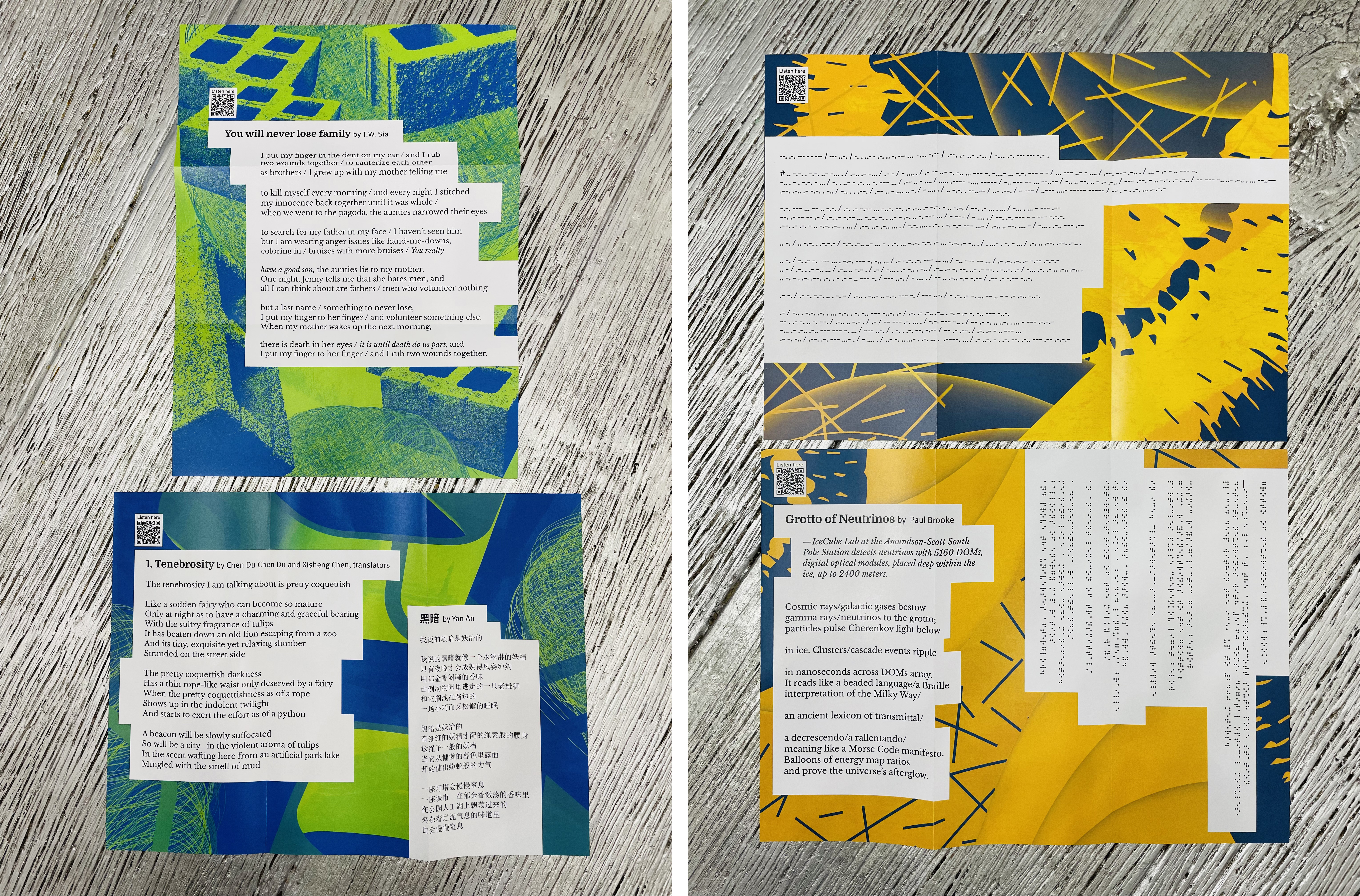
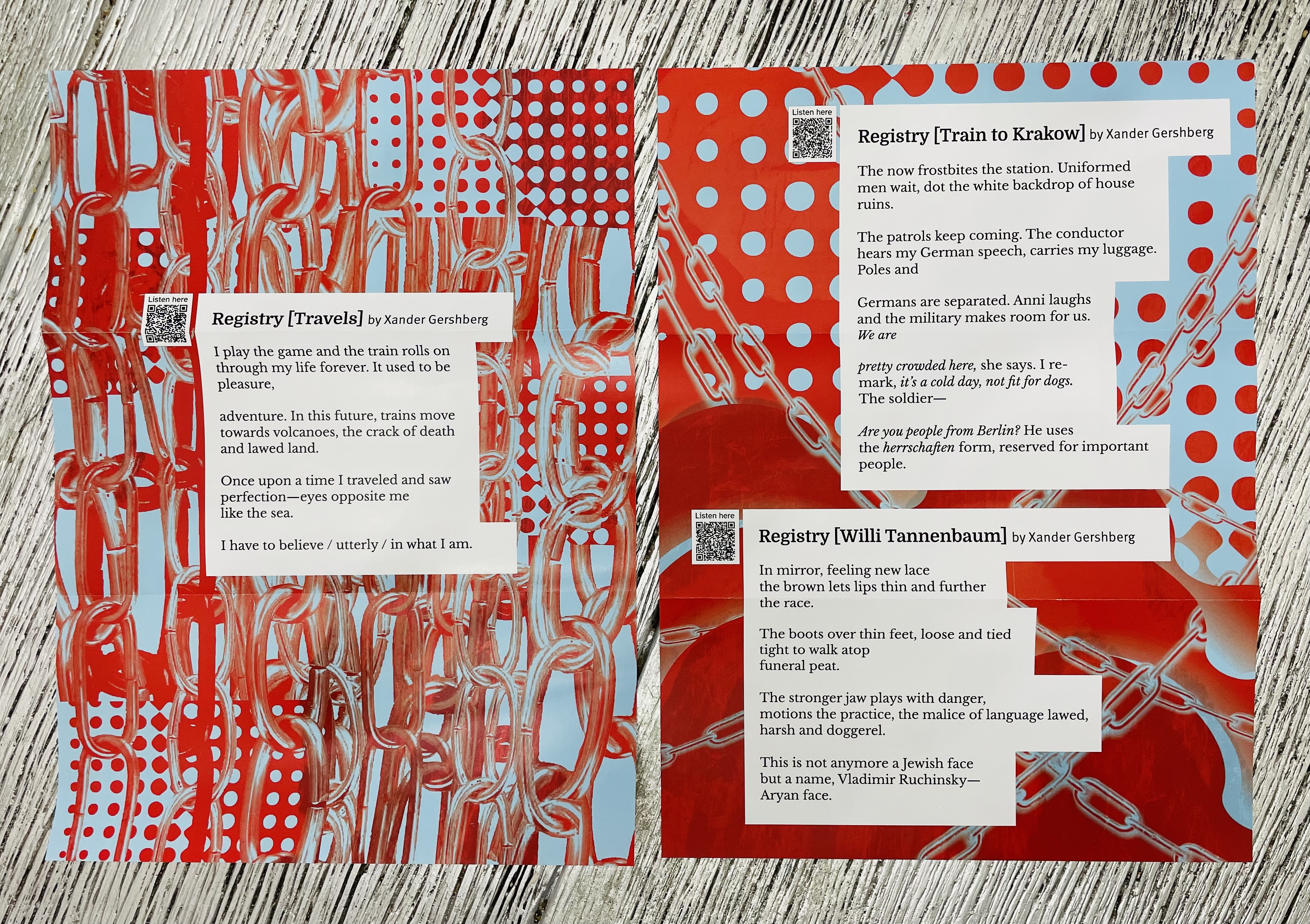
Vol. 12 (2024)
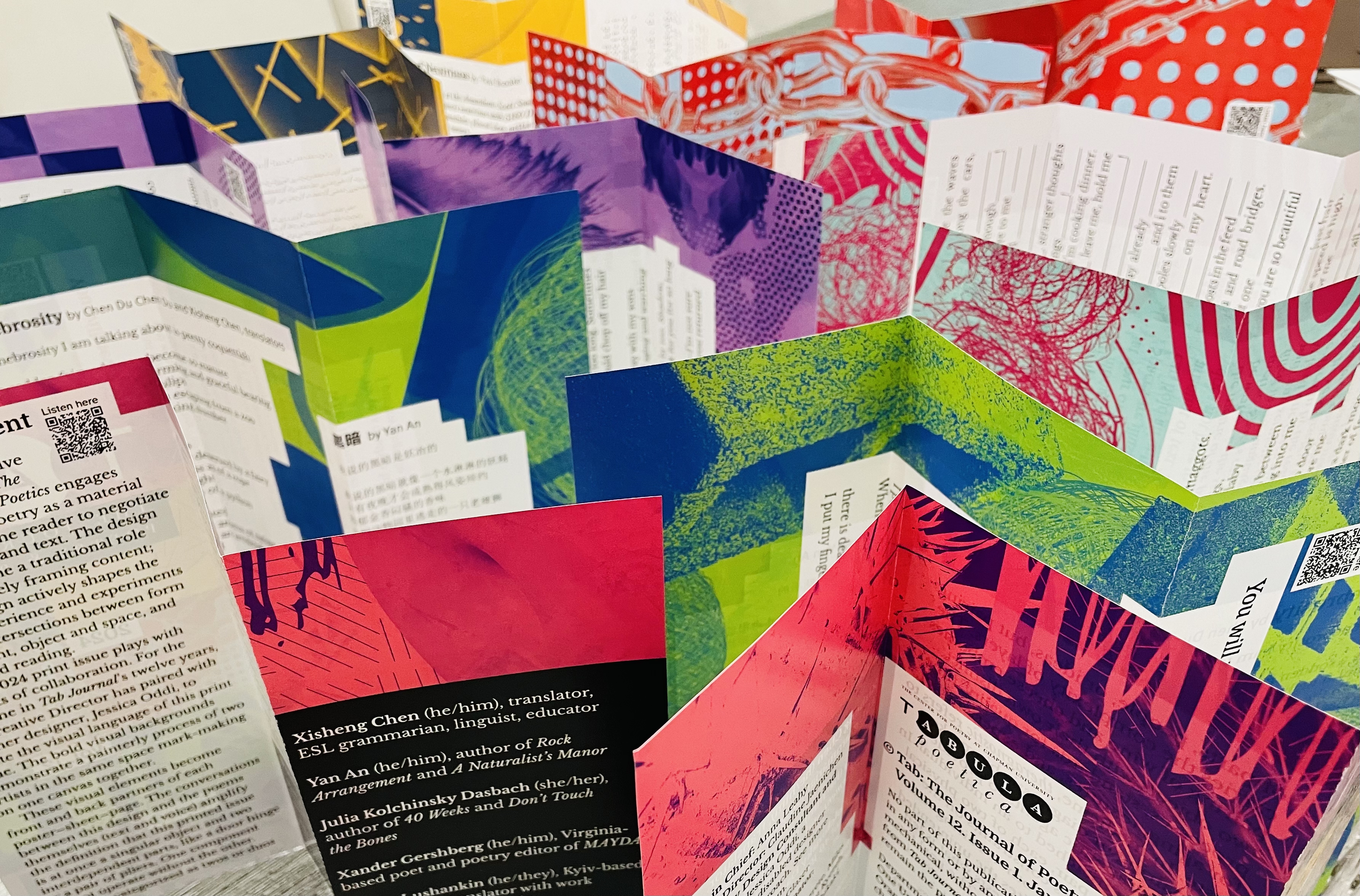
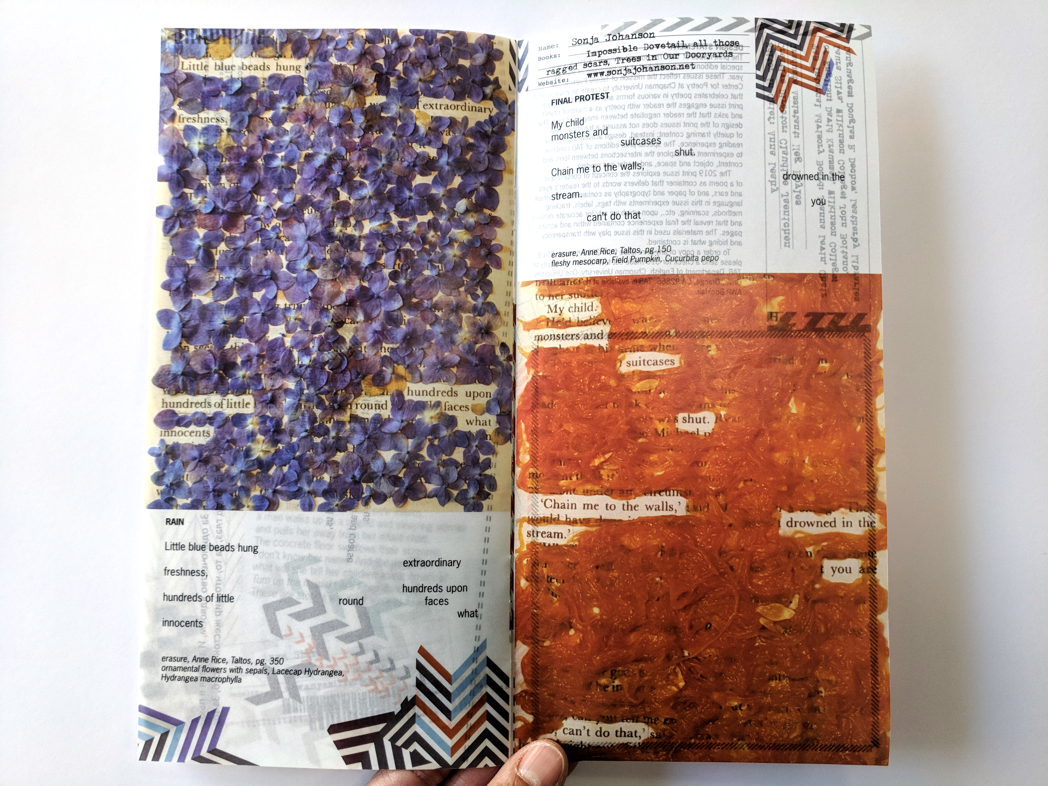
The 2024 print issue plays with concepts of collaboration. For the first time in Tab Journal’s twelve years, the Creative Director has paired with another designer, Jessica Oddi, to create the visual language of this print issue. The bold visual backgrounds demonstrate a painterly process of two artists in the same space mark-making on one canvas together.
These visual elements become front and back partners of each poster–sheet–page. The conversations between this design and the poems themselves (text and voice) amplify the definition that this printed issue is at once a singular object and two interdependent parts, like a door hinge or a pair of pliers. One component cannot operate without the other. Pairs are categorized as twos or duos of parts, people, or ideas, but pairing carries the complexity of layers. The pairing of wine and cheese embodies two objects with their own distinct processes, standards for quality, time for aging, textures, and experience of taste. In medicine, theragnostic refers to the pairing of diagnostic biomarkers with therapeutic agents to provide treatment matched to an individual. In a kinematic pair, each of two physical objects imposes constraints on the movement of the other. Pairing risks the mismatch, invites the unintended connection, and suggests what is left out by quantitive limits. The goal for this issue is partnership, conversation, and celebration of the depth and complications of useful pairings.
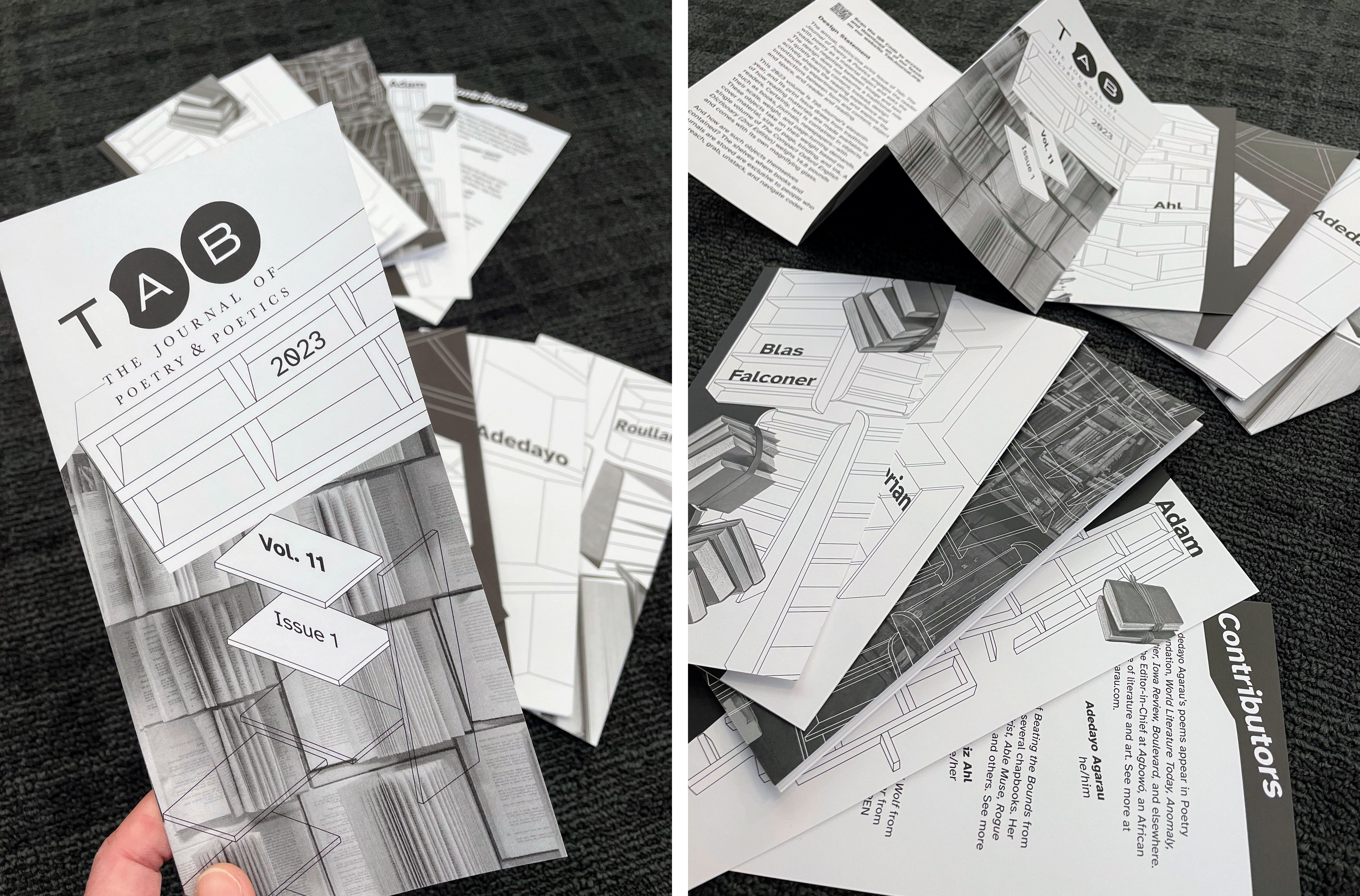
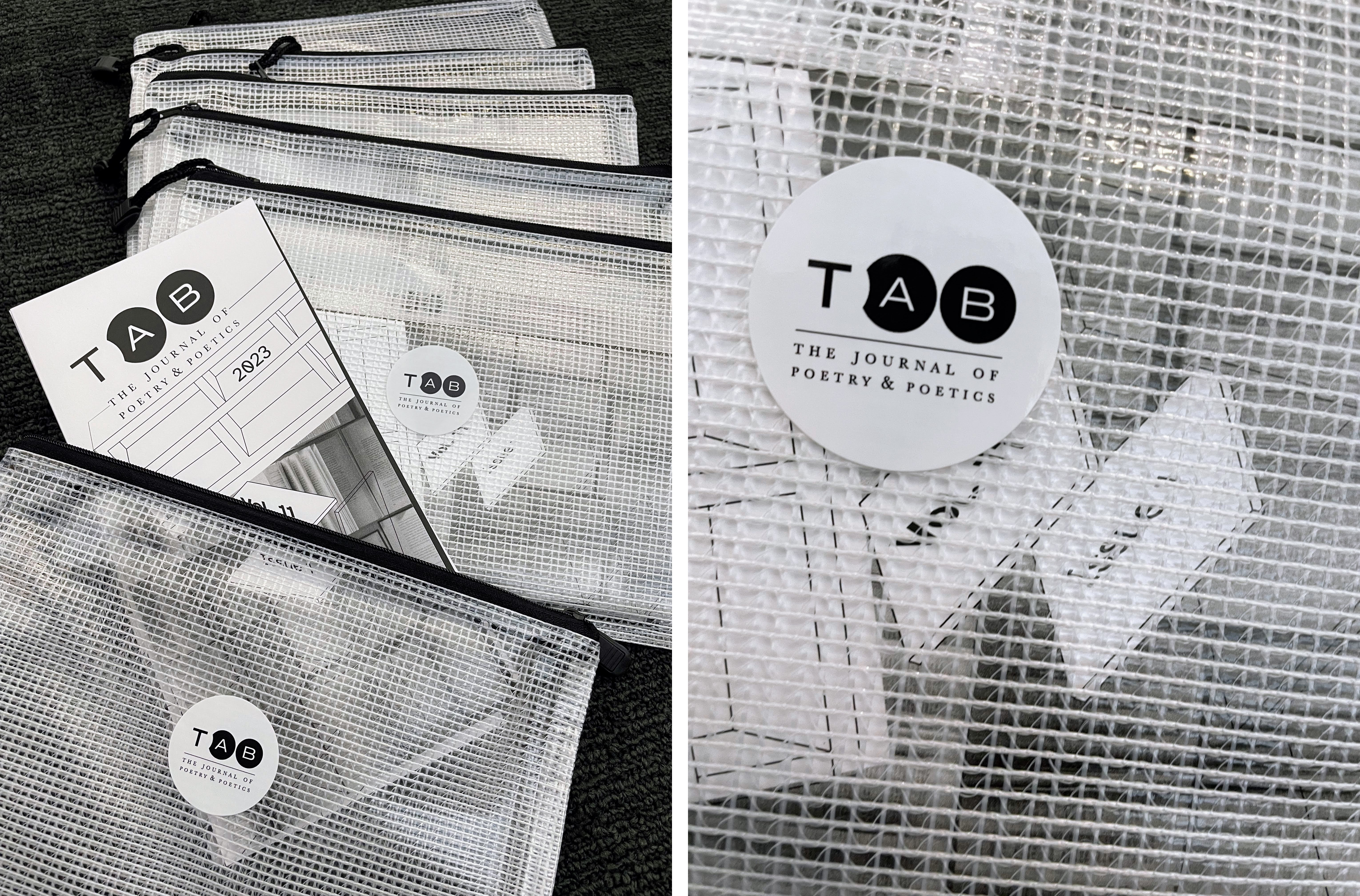
Vol. 11 (2023)
This 2023 volume is Tab Journal’s eleventh year, and its print issue draws from traditions of how reading materials are made available to readers. Certainly, text is contained in objects such as books, journals, newspapers—with their scale, weight, and page-turning demands. These objects take on their weight based on cover material, size of page, binding, and ink. A single volume of The Compact Oxford English Dictionary (2nd Edition) weighs 14.8 pounds and comes with its own magnifying glass.
And how are such objects themselves contained? The shelves where books and journals are stored are exclusive to people who can reach, grab, unstack, and navigate codex systems, all within the rooms and buildings that shelves—and readers—occupy. Henry Petroski writes in The Book on the Bookshelf, “Books and bookshelves are a technological system, each component of which influences how we view the other. Since we interact with books and bookshelves, we too become part of the system. This alters our view of it and its components and influences our very interaction with it.”
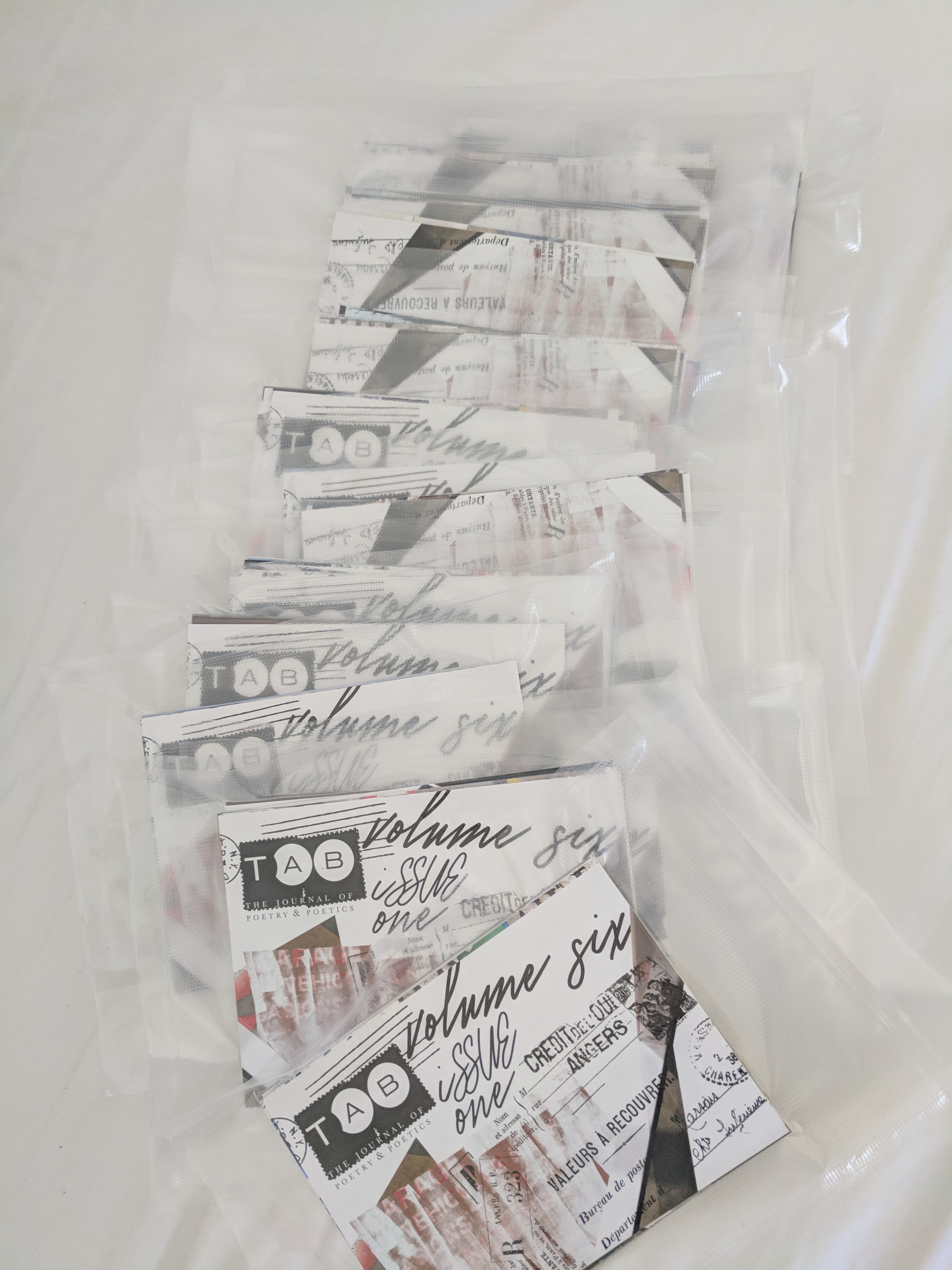
In Volume 11, Tab Journal questions access in relation to interaction and portability. With digital and audio formats of reading material, what is the place for print? Tab Journal strives for flexibility in a physical interaction yet defies the traditional anatomy of a codex—a spine, page signatures, and an obvious cover. It is not waiting to be chosen from a shelf. Instead, the print issue takes its storage with it in the form of a pouch where other things can join in its container, just as a phone or tablet is a portable container for poetry and much more.
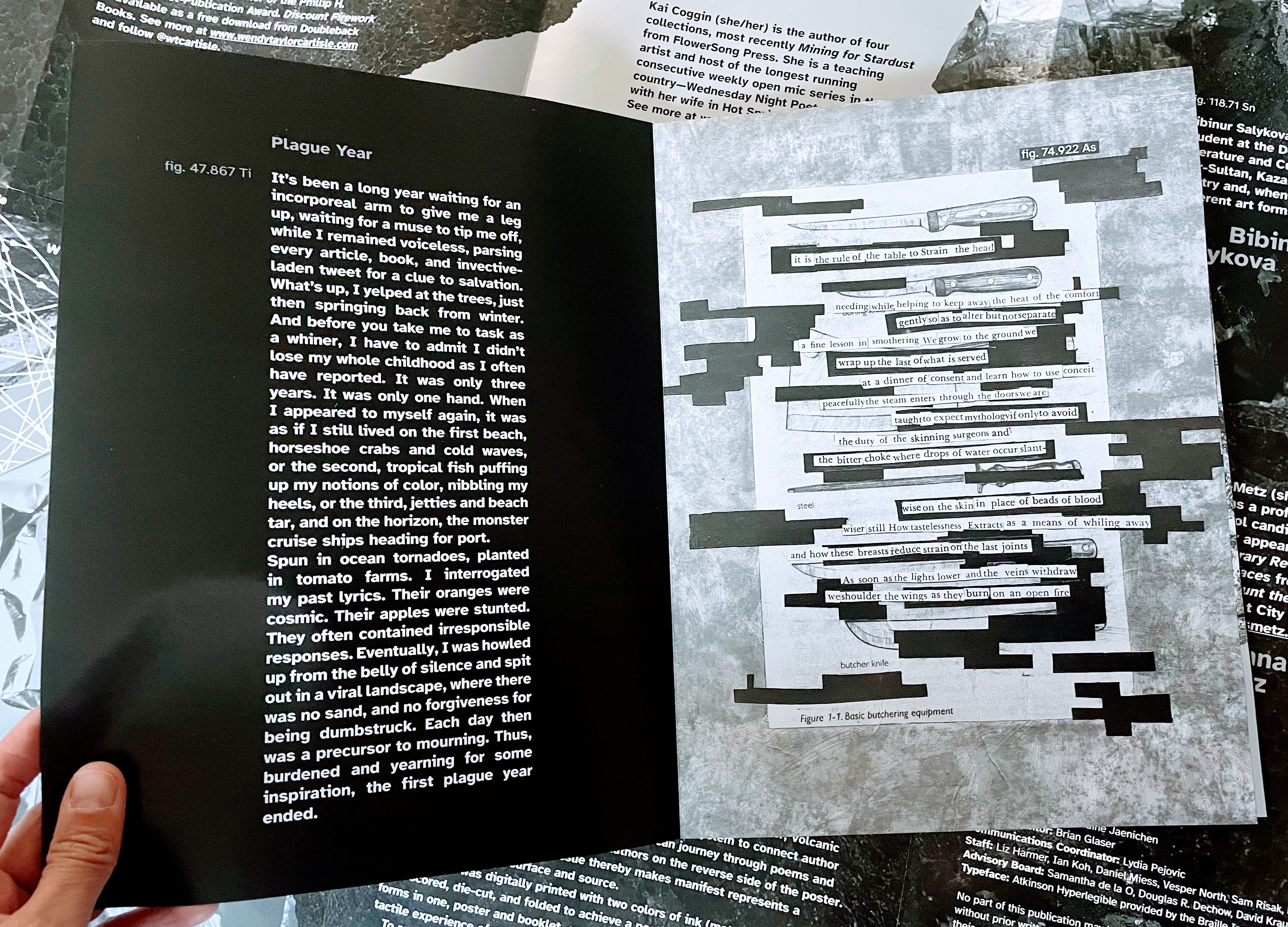
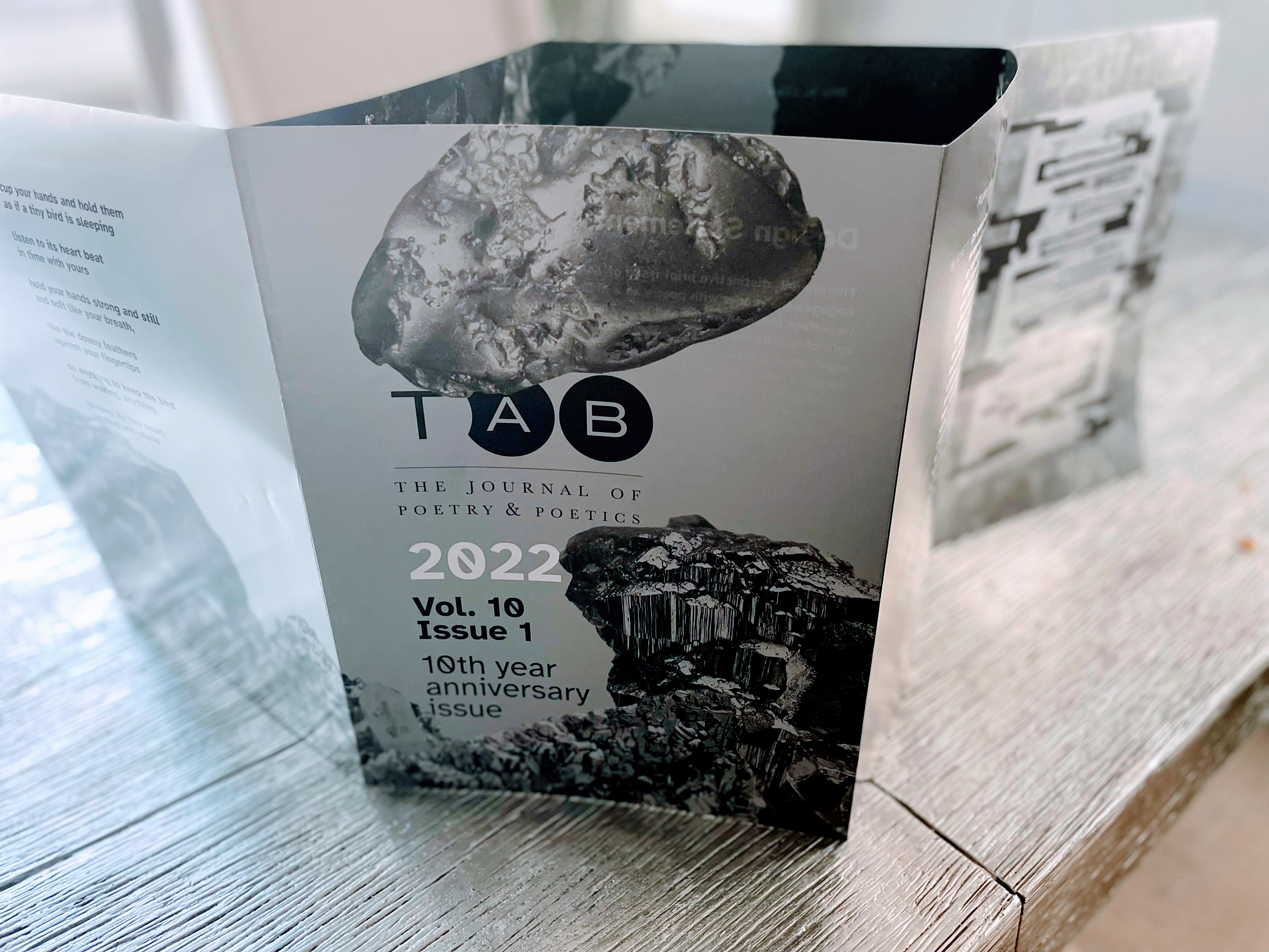
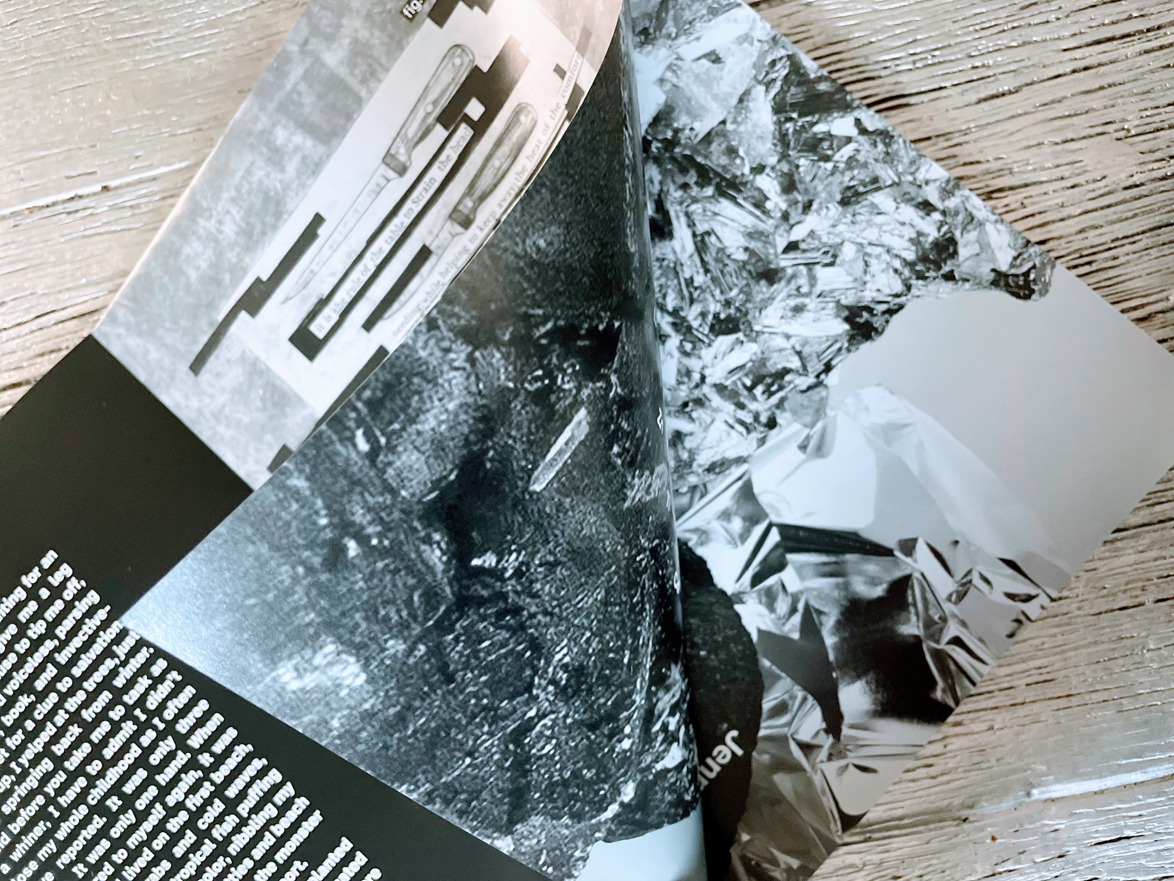
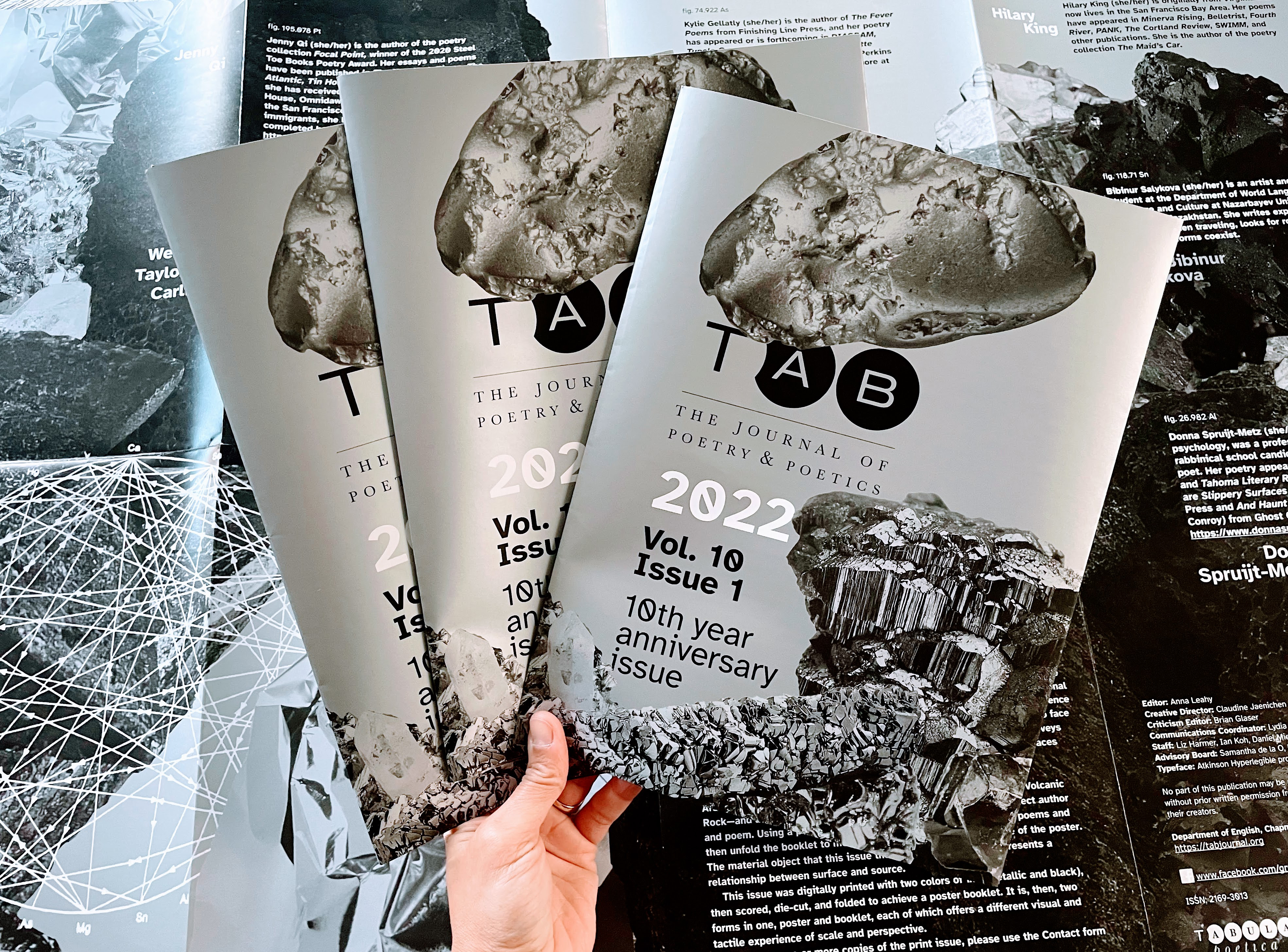
Vol. 10 (2022)
This 2022 volume is our tenth issue. It is no coincidence, then, that it echoes the durability and usefulness of aluminum and tin, the traditional tenth-anniversary gifts. This volume, launched with a large-format print issue, quite literally reflects and shines and is our gift—from the staff and the contributors—to literary culture.
The design for 2022 emerges from a year of recognizing the complexities of choice, drawing boundaries, and acknowledging the multidimensional anxieties of being between a rock and a hard place. The visual language draws on the mining of minerals—Arsenopyrite, Aluminum, Platinum, Tin, Tennantite, Titanium, Silver, and Volcanic Rock. This volume surveys concepts of shared corners and shelters, of physical and metaphorical places and spaces where individuals, pods, and communities take refuge.

Vol. 9 (2021)
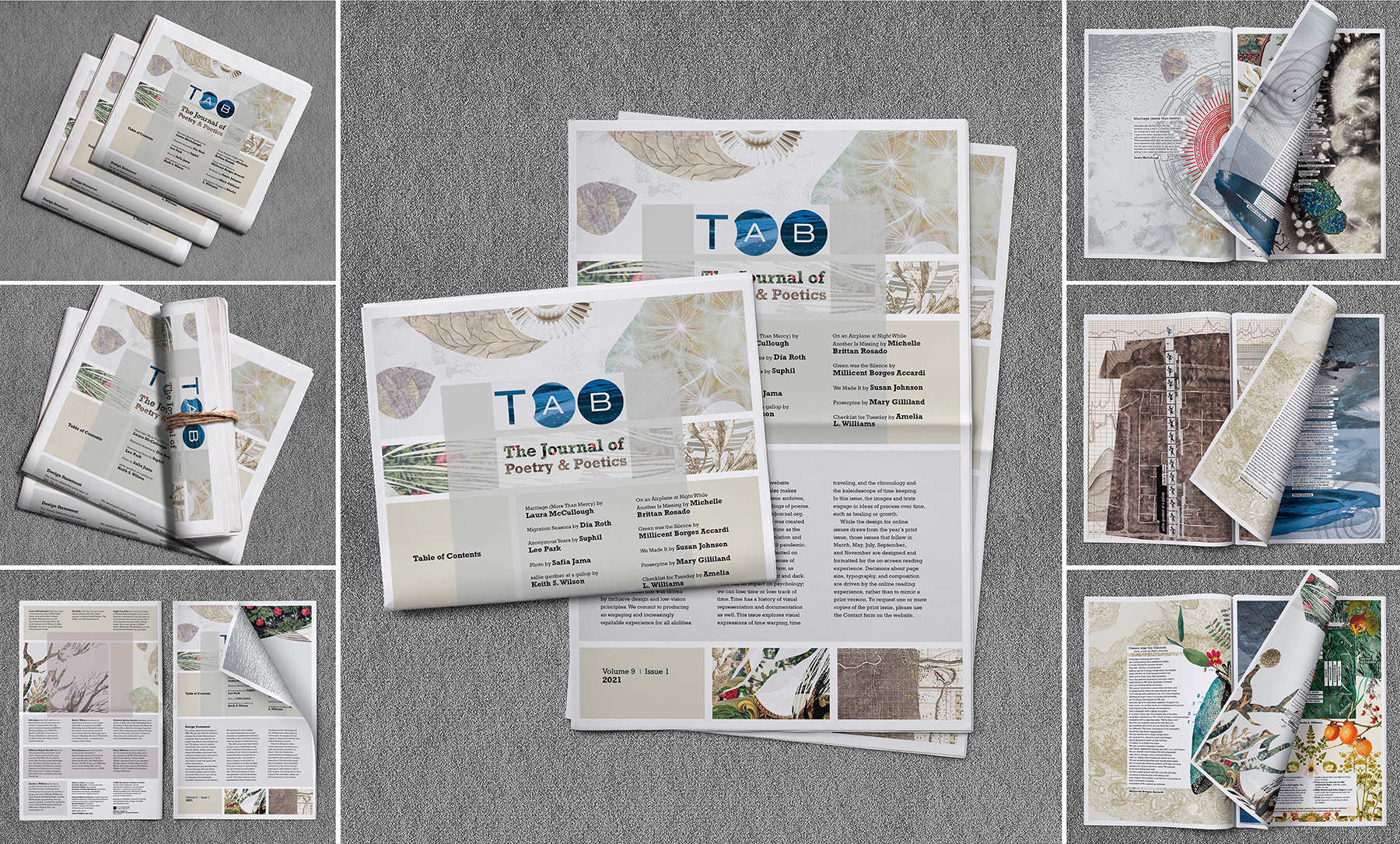
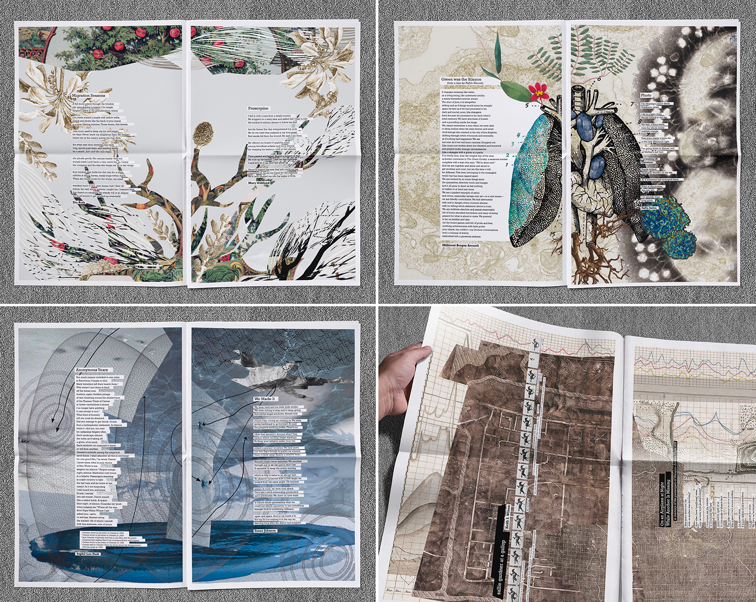
The 2021 print issue of Tab Journal was created during a time of quarantine as the world underwent the isolation and anxieties of the Covid-19 pandemic. During this time, we reflected on concepts of time—as a sense of place, as space, as structure, as the visual experience of light and dark. Time has an impact on psychology; we can lose time or lose track of time. Time has a history of visual representation and documentation as well. This year’s print issue explores visual expressions of time warping, time-traveling, and the chronology and the kaleidoscope of time-keeping. In this issue, the images and texts engage in ideas of process over time, such as healing or growth. The large-format newsprint suggests additional ways to consider time, history, and cultural documents.
We usually do not share the entirety of the print issue online because it is designed specifically for the print medium and in a new format each year. In part, because covid restrictions in Southern California have slowed our efforts to mail the print issue, we are making an exception. Below is the full pdf of the print issue itself, in addition to all the poems in audio format, which we had planned for increased accessibility. Keep in mind that we used large-format newsprint this year; the reading experience is quite different on a screen, as the relationships across poems and between text and image is altered.
We plan to mail the print issue to all Tab contributors (from all nine volumes!) by February 12. Teachers and librarians who would like to distribute copies of the print issue for discussion can use the Contact form to request a batch. The online issues in the 2021 volume of Tab Journal will pick up elements of the print issue’s design, and the website has been updated to reflect Volume 9.
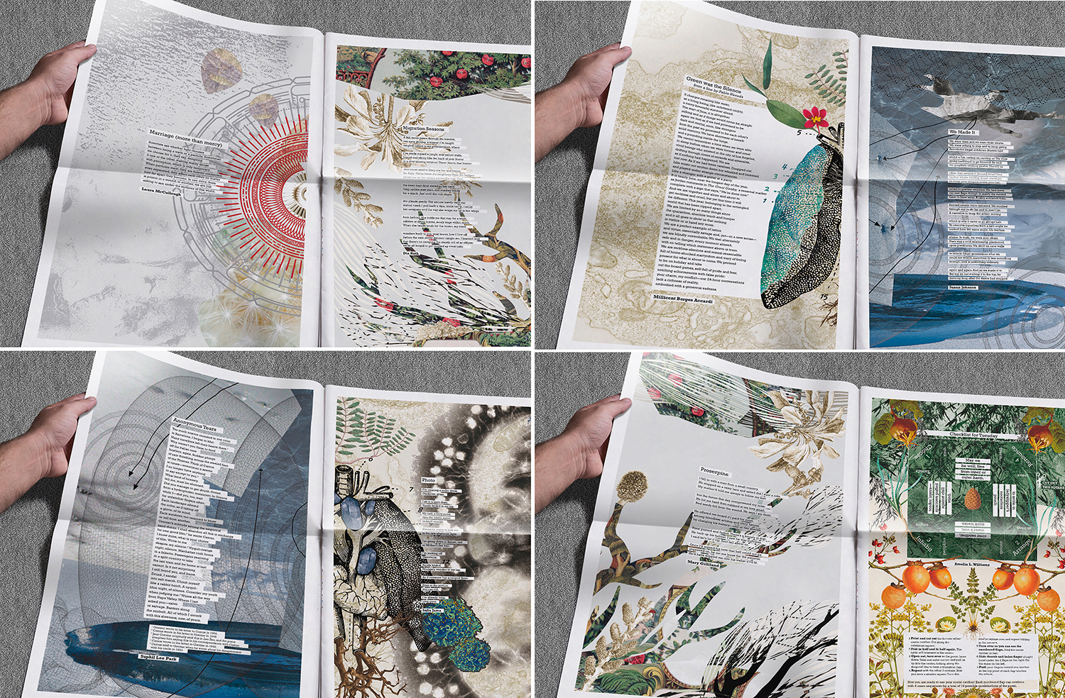
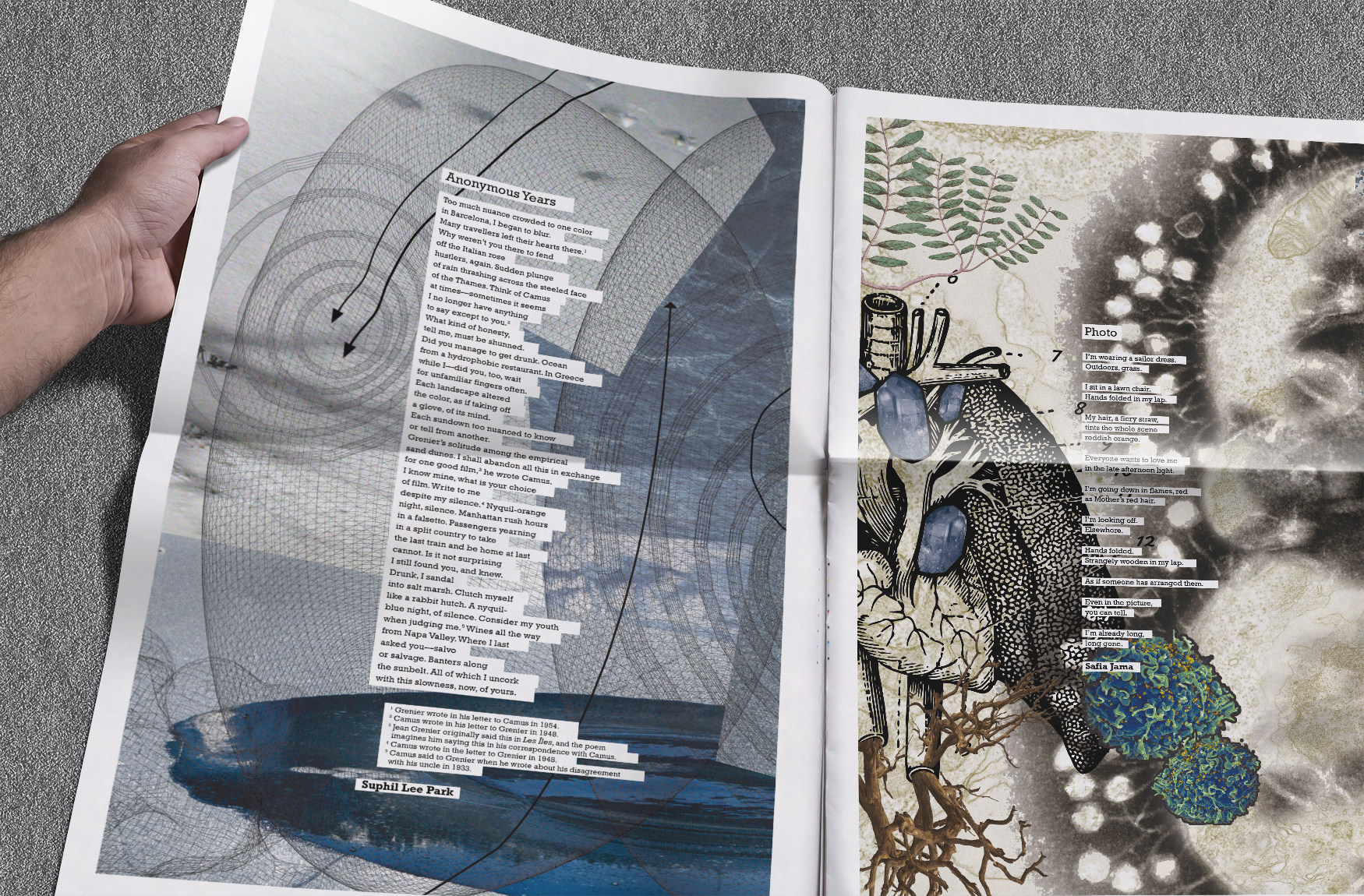
The newspaper opens into broadsheet posters:
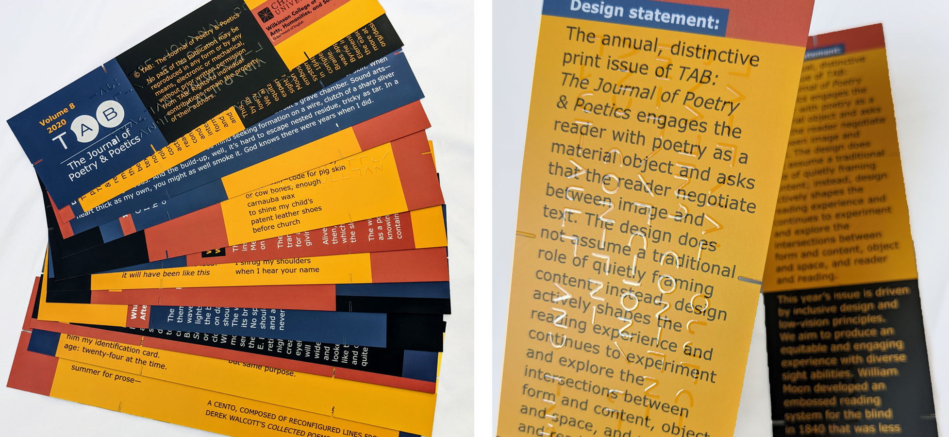
Vol. 8 (2020)
The 2020 print issue was driven by inclusive design and low-vision principles. We aimed to produce an equitable and engaging experience with diverse sight abilities.
In 1840, William Moon developed an embossed reading system for the blind that was less complex than learning Braille. The Moon system was particularly useful for people who had lost their sight later in life because the Roman alphabet had already been deeply rooted in their cognitive recognition and recall and proved easier to learn than the abstract system of Braille. Moon’s system could be taught and learned in only a few days.
Color blocking was applied with the same approach Oliver Byrne applied in The Elements of Euclid in1847 for ease of learning. Colors and geometric blocking similar to Byrne’s helped demarcate content and organize the reading experience while still maintaining the intended interactive experience. The design also used a matte finish and increased contrast for readers with varying contrast sensitivity.
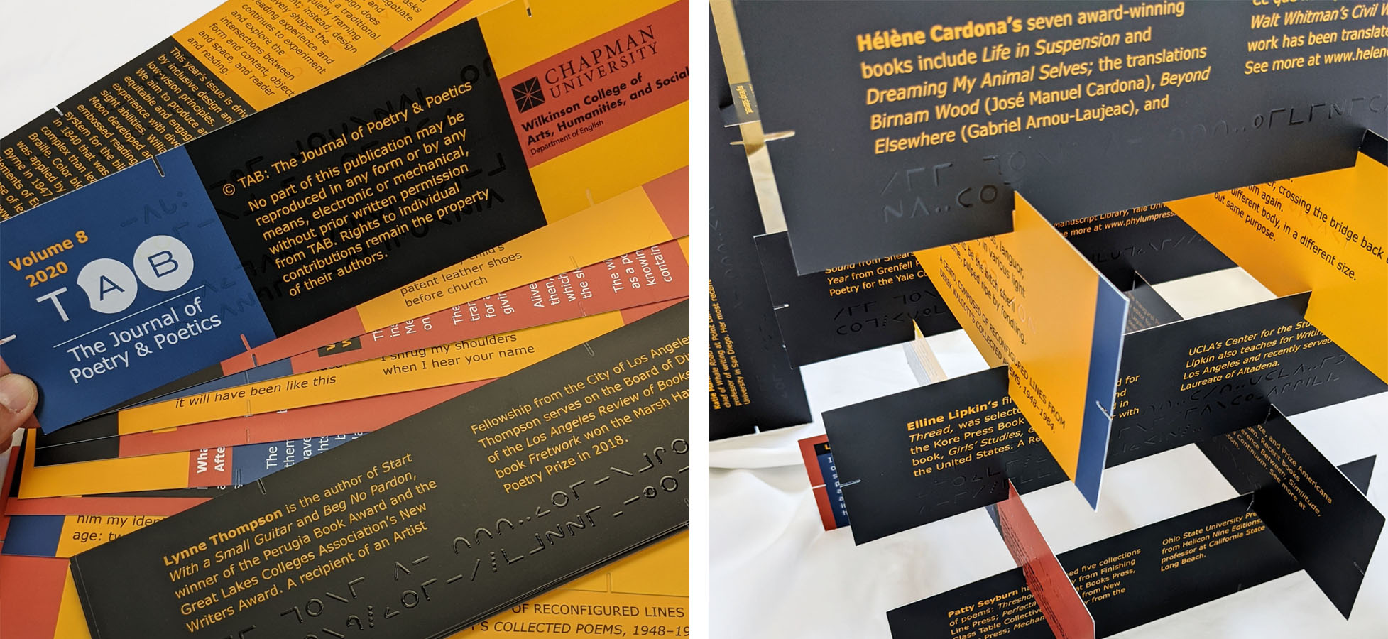
In addition to the visual elements, the pages of the 2020 print issue of Tab Journal were not pages so much as a set of twelve rectangular cards on which some poems appear vertically and others appear horizontally. While the stack arrived with poems ordered alphabetically by the last name of the poets, the contents were not paginated and can be shuffled and read in any order.
Further, the cards were notched on all sides, which allows the reader to hook them together in various physical forms. It’s relatively straightforward to build a structure that reorients the poems. As with previous print-issue designs, this year’s encourages readers to be aware of reading as an experience.

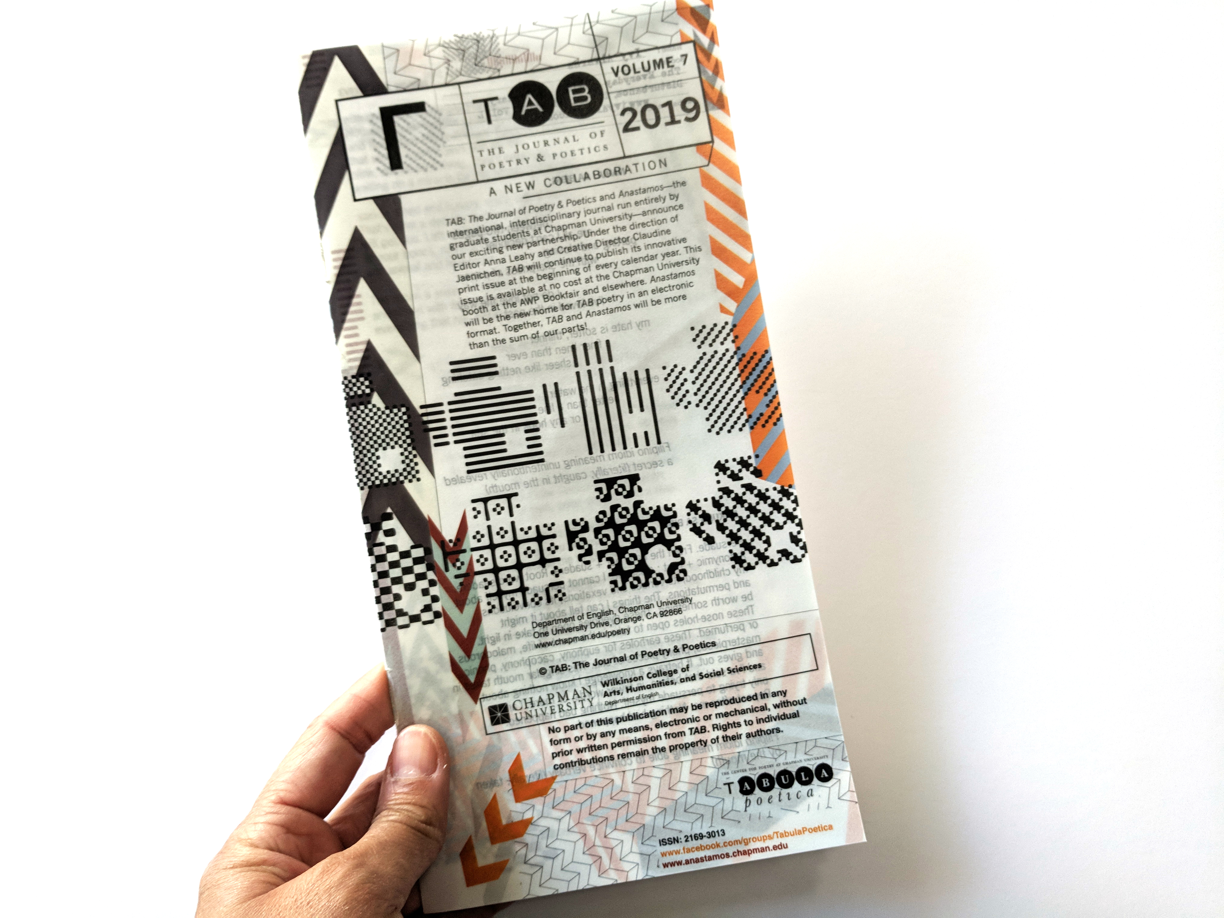
Vol. 7 (2019)
The 2019 print issue explores the concept of containment, of a poem as a container that delivers words to the reader’s eyes and ears, and of paper and typography as containers. The visual language in this issue experiments with tags, labels, tracking methods, scanning, etc., upon which we rely for accurate delivery and that reveal the final experience contained within and across pages. The materials used in this issue play with transparency and hide what is contained. Printed on translucent vellum, 4-color digital.

Vol. 6 (2018)
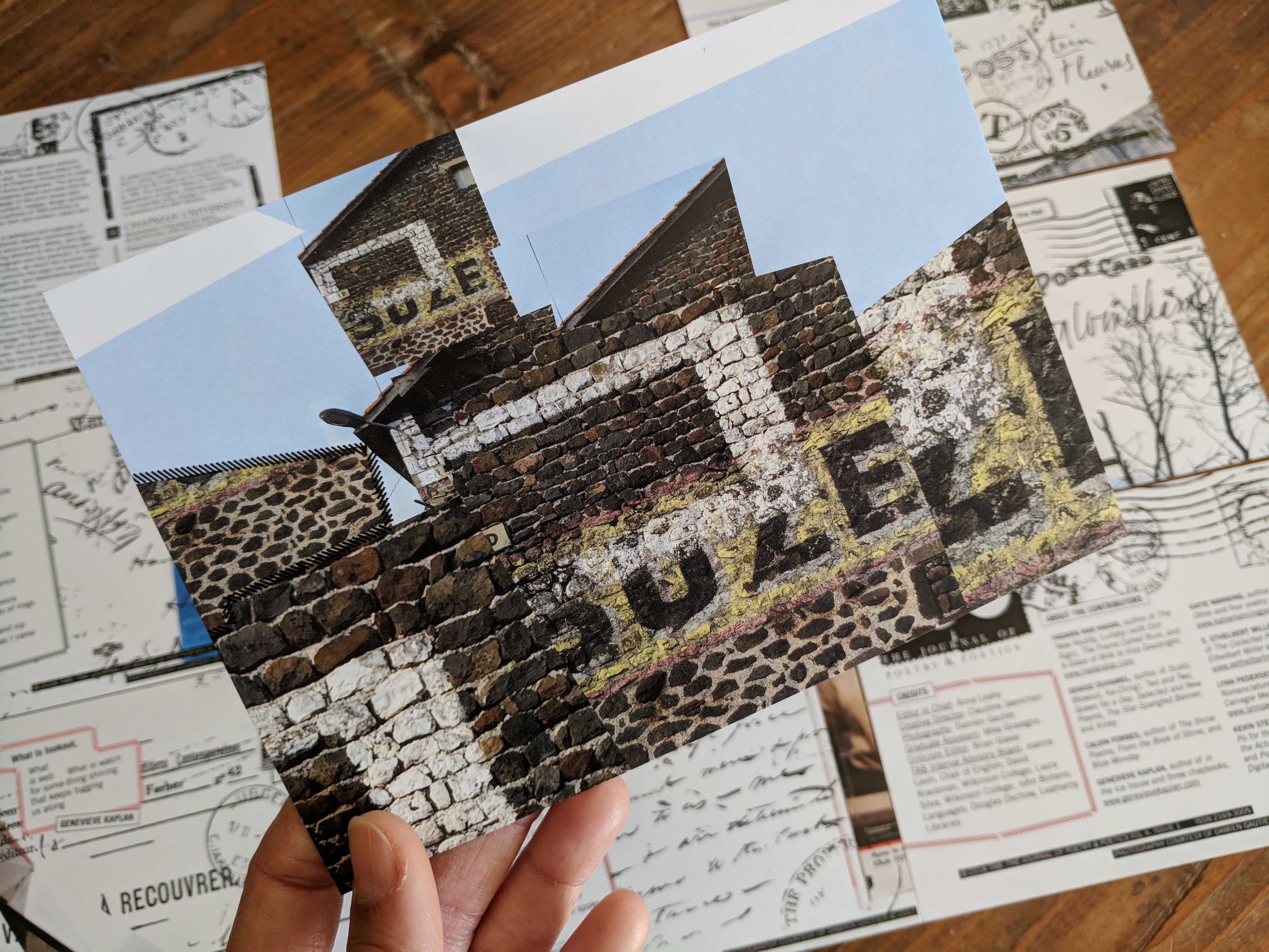
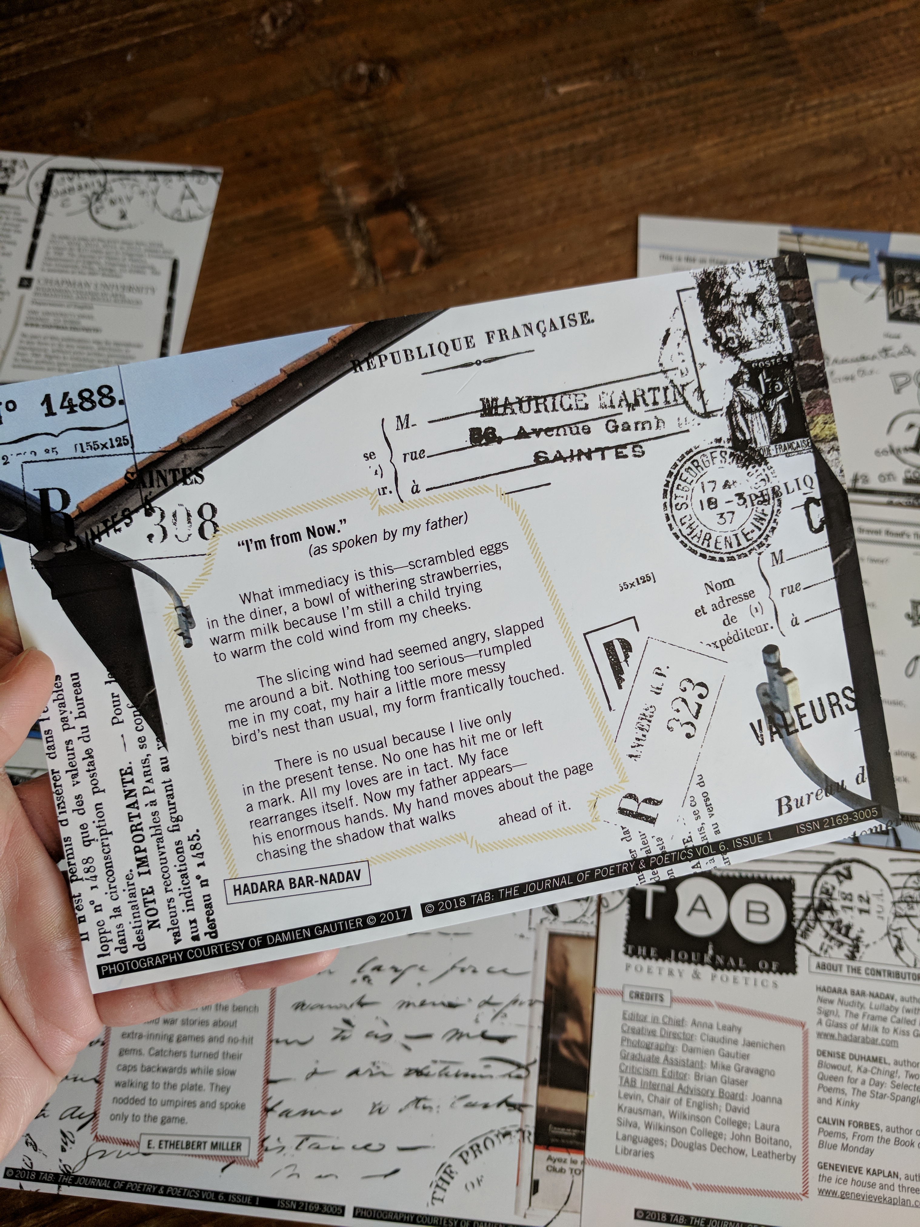
The 2018 print issue amplifies the qualities in aesthetics and materials of ephemera as the main framework for poetry. Photography by Damien Gautier was rearranged, sliced, and layered to call attention to the arbitrary size and two dimensions of both the physical photograph and the postcard. In today’s world of excessive materials in a disposable culture, we revisit the function and permanence of a collection of postcards. We examine the origin and value of a postcard as a record of personal travel, propaganda, and advertisement and how some collections end up being documents of preservation.
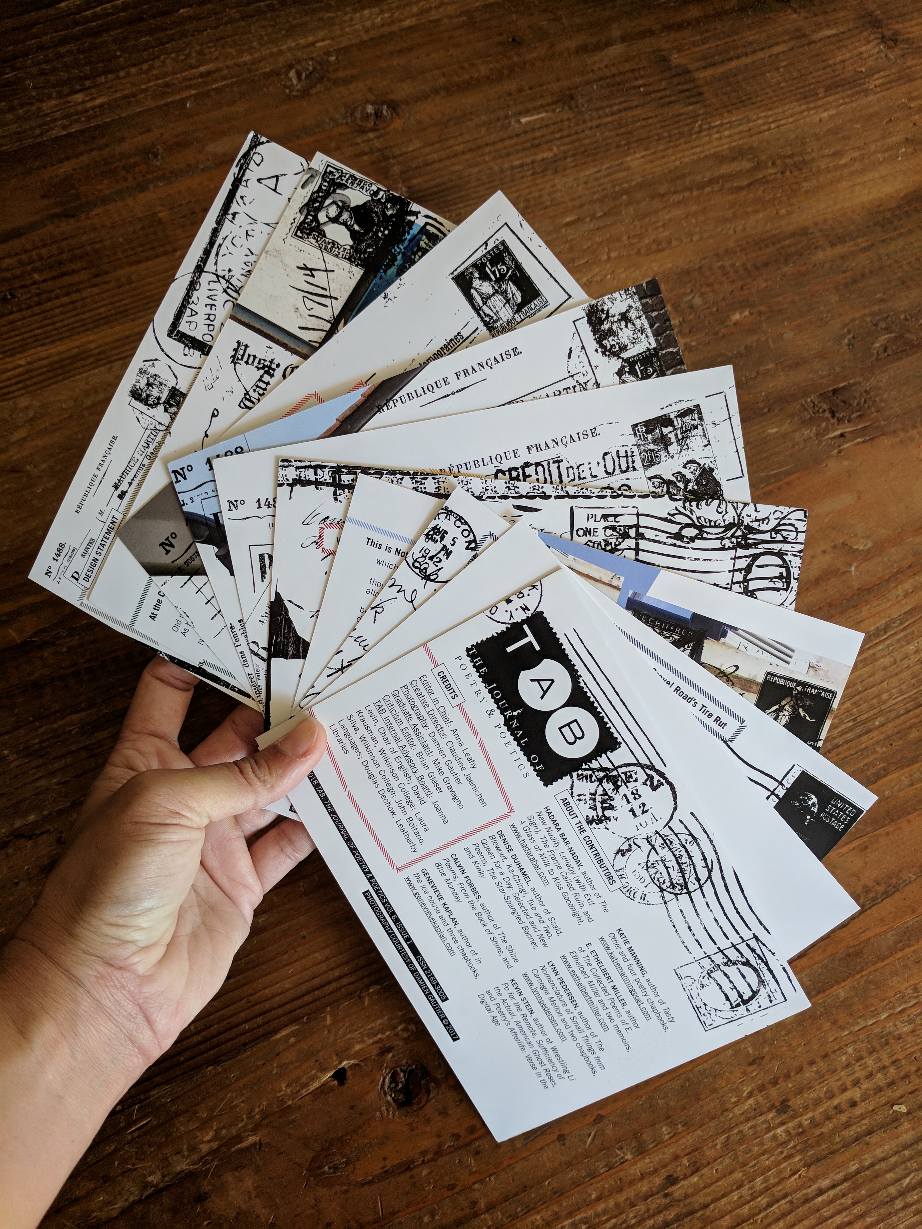
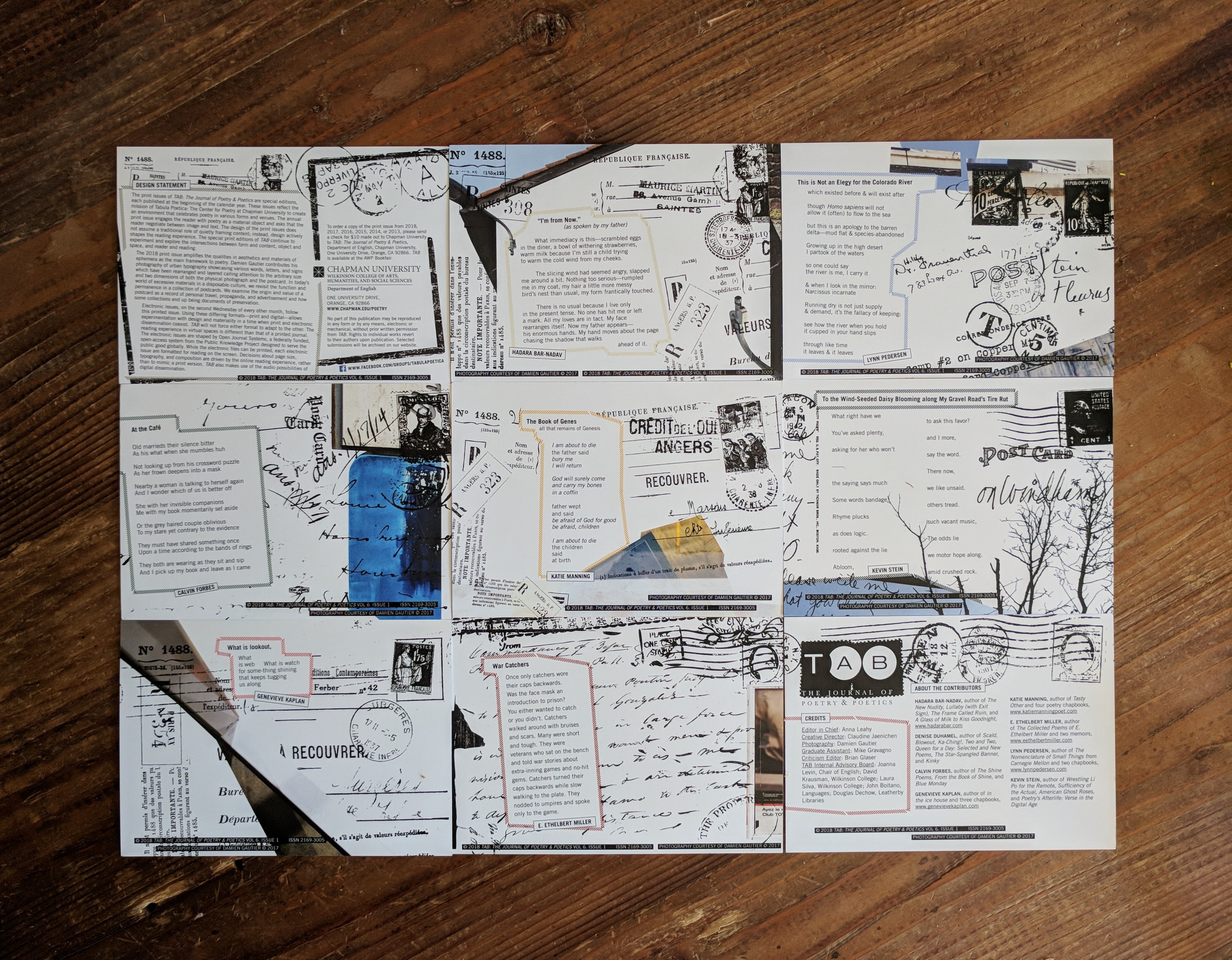
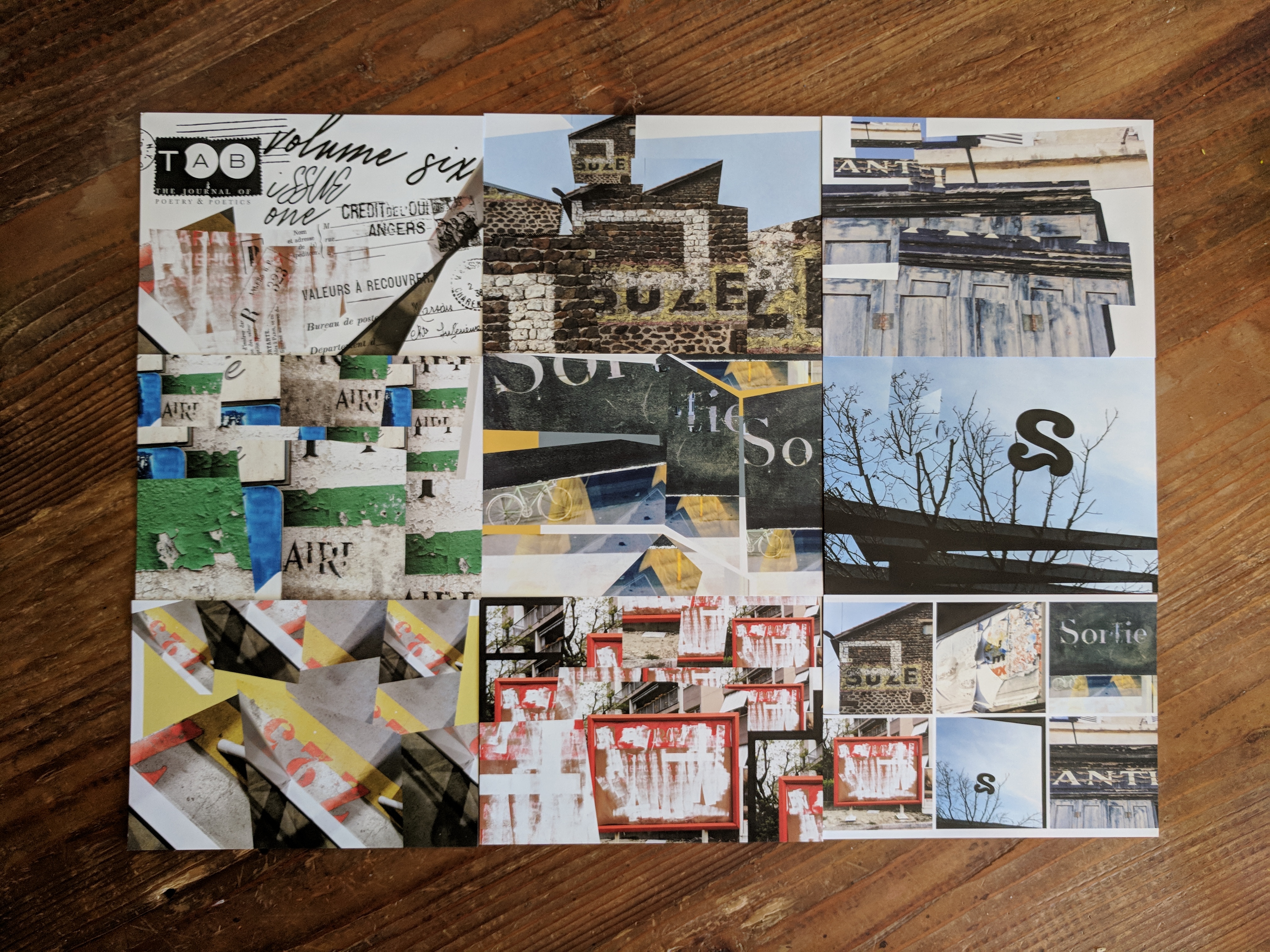
Damien Gautier contributes his photography of urban typography showcasing various words, letters, and signs (Gautier’s original photography is displayed on the last bottom right postcard).
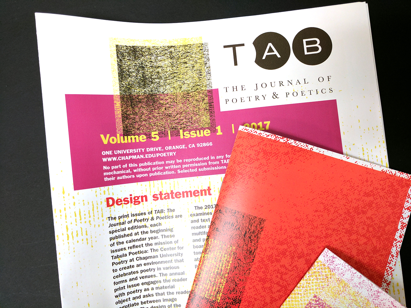
Vol. 5 (2017)
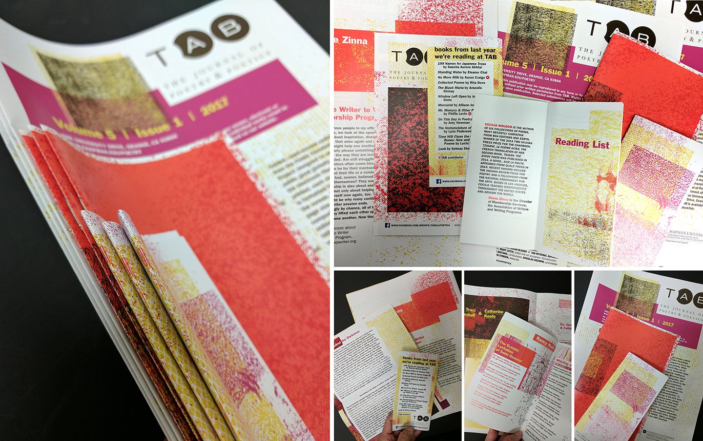
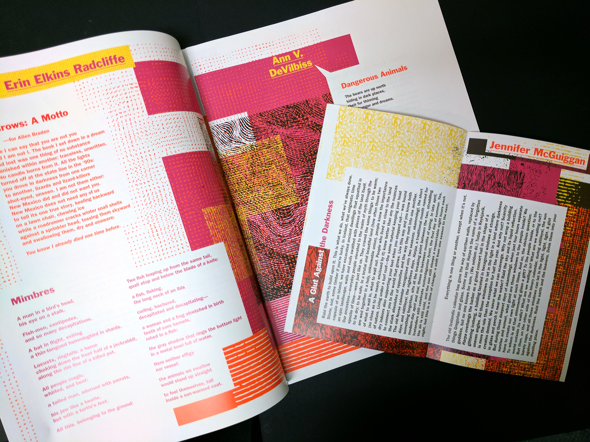
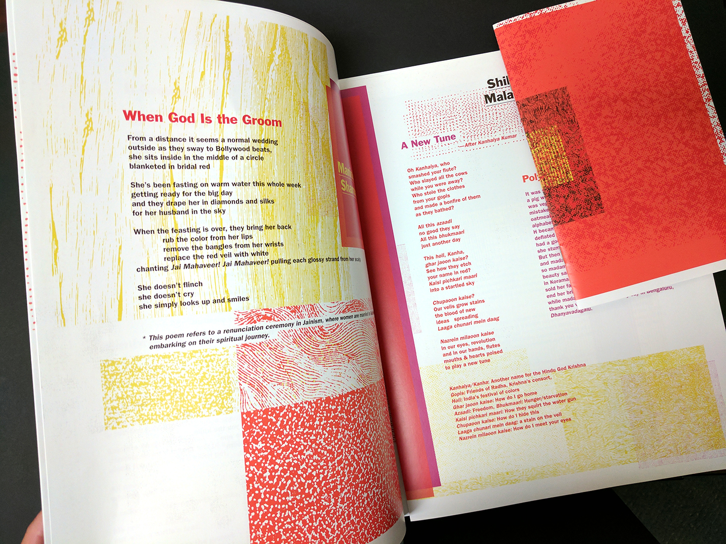
The 2017 print issue examines the effects of noise and text delivered to the reader as visual volumes on multifaceted layers. Textures and patterns act as a sounding board, adding a variety of tones intended to create an atmospheric pairing with the poems themselves. There are 3 booklets, each 16-pages. The largest booklet (9 x 12) includes paired poets between mentee and mentor. The middle booklet (5 x 8) are single poets and the smallest (3 x 6) is a bio/reading list mini catalog.

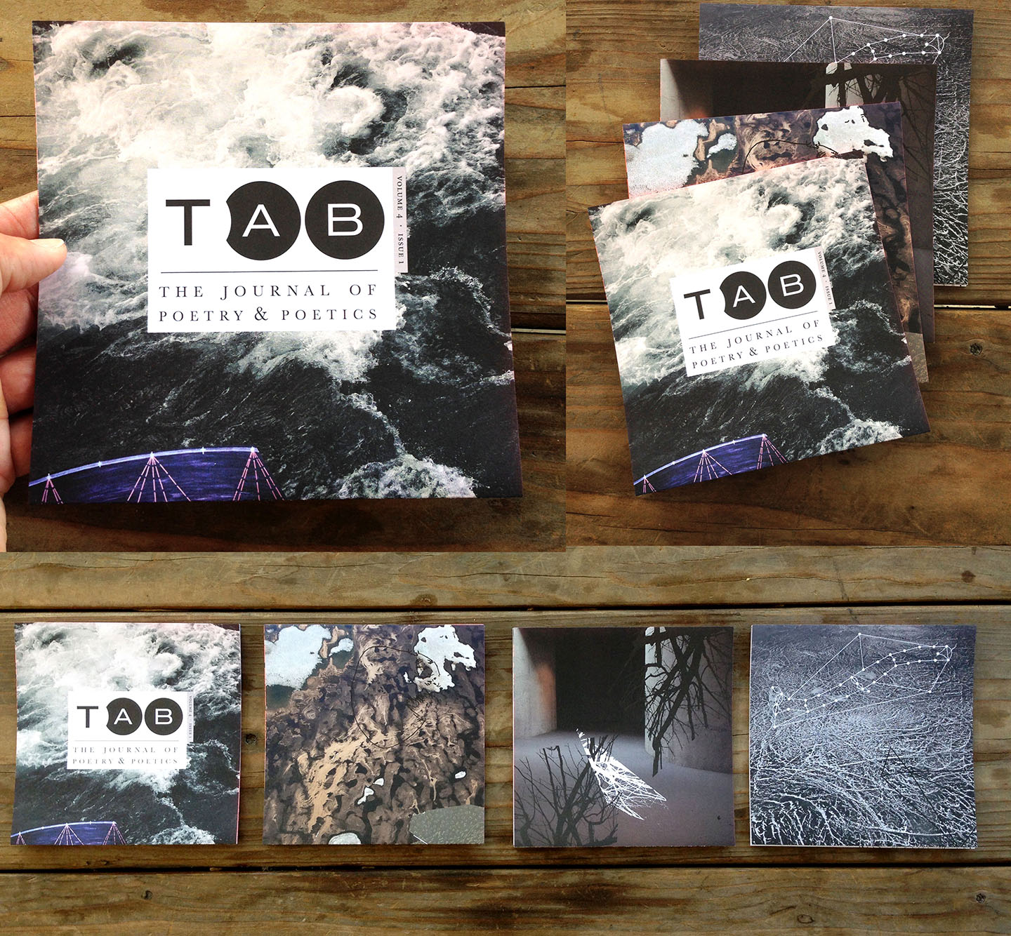
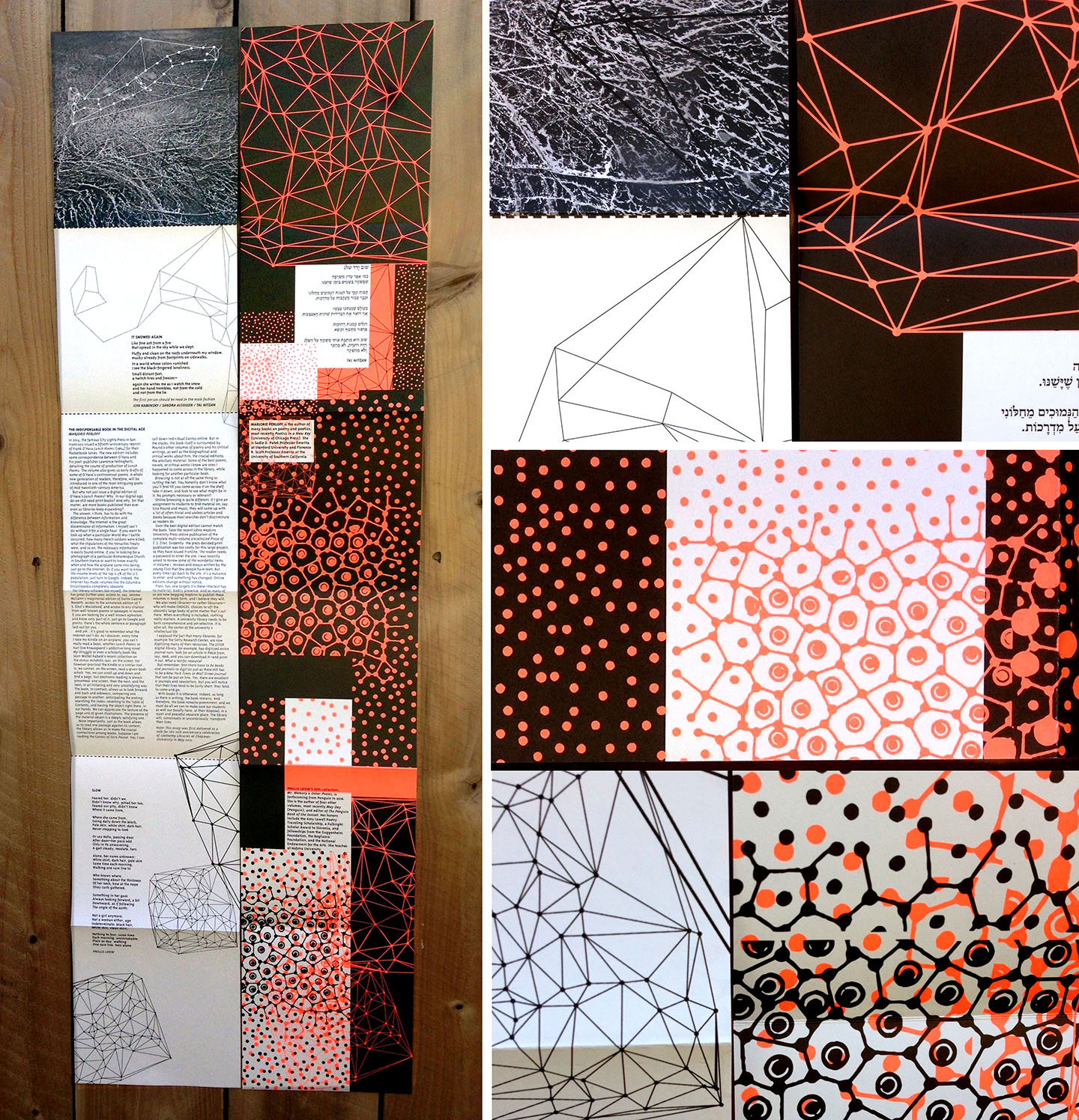
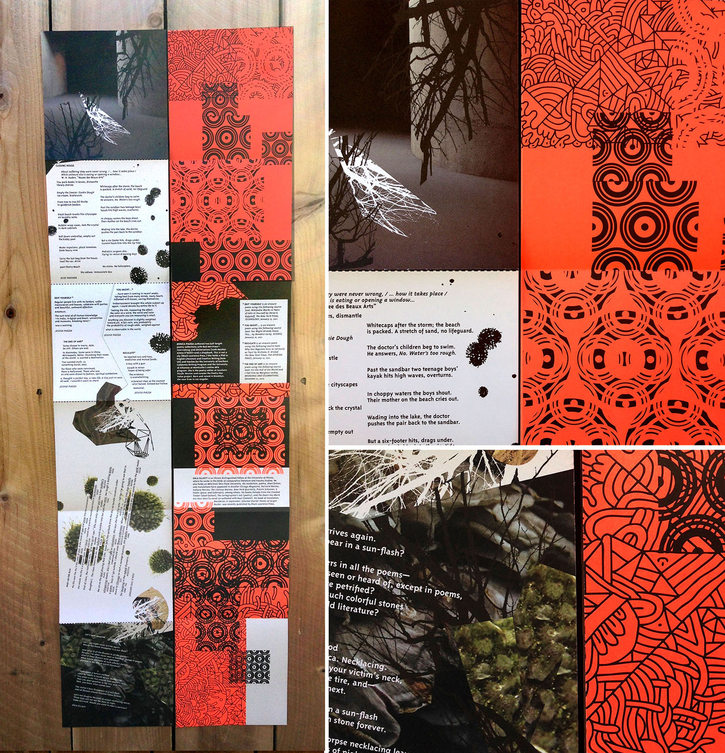
Vol. 4 (2016)
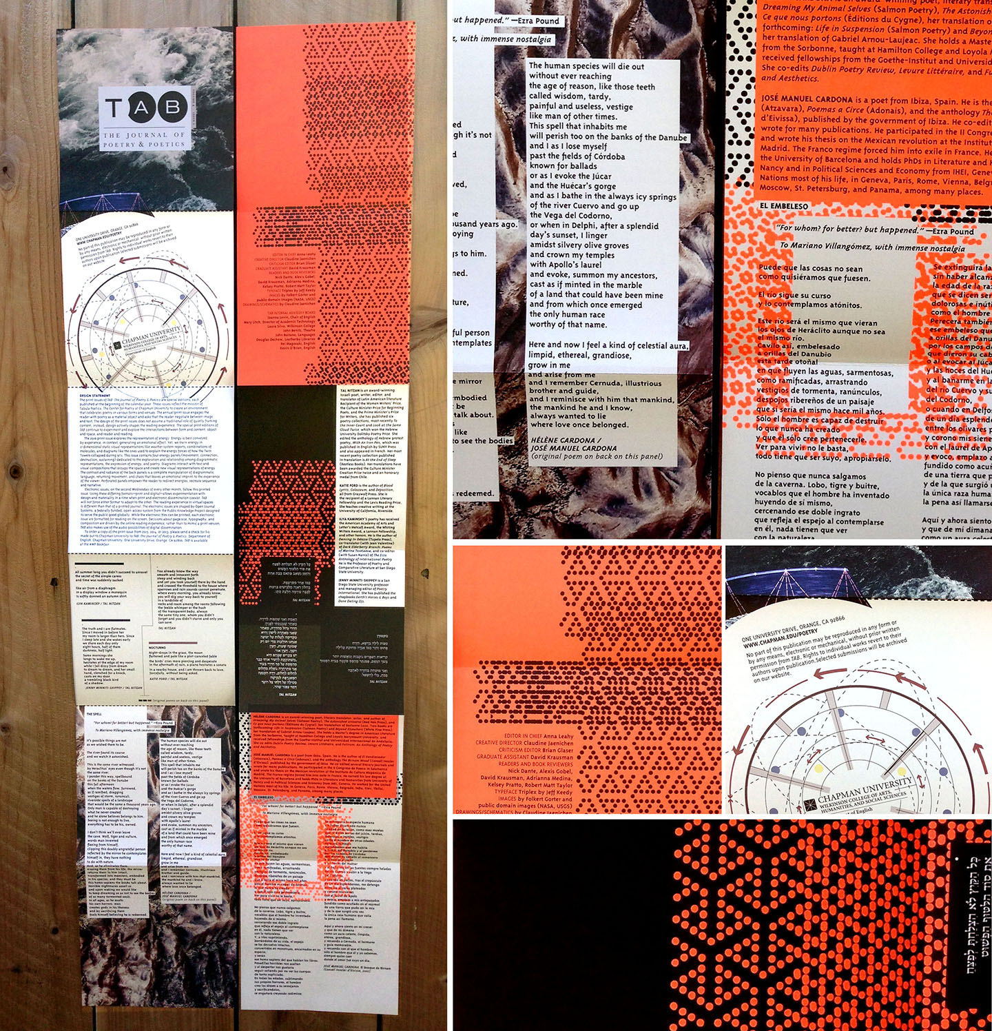
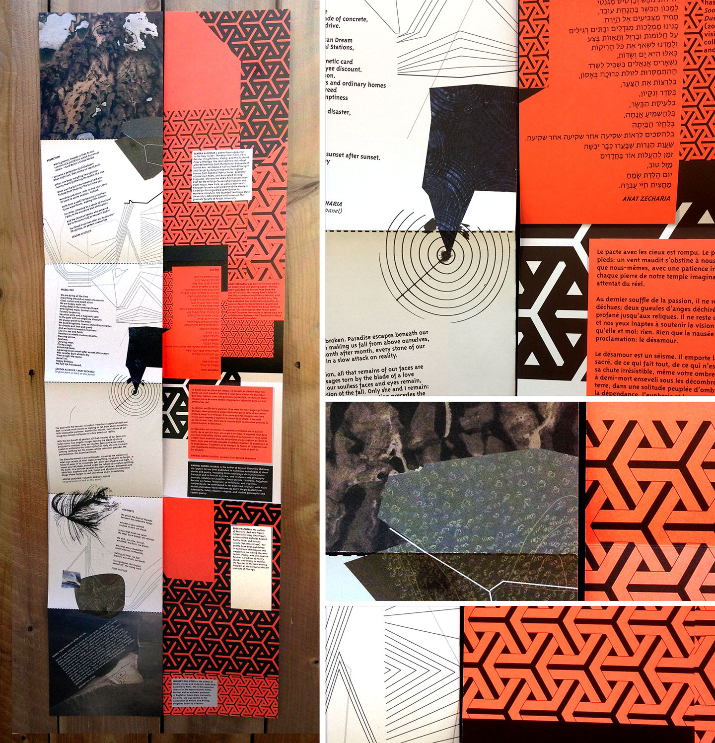
The 2016 print issue explores the representation of energy. Energy is best conveyed by experience, in context, generating an emotional effect. Yet, we learn energy in 2-dimensional static visual representations like weather system reports, combinations of molecules, and diagrams like the ones used to explain the energy forces of how the Twin Towers collapsed during 9/11. This issue contains four energy panels (movement, connection, destruction, sustaining) dedicated to the exploration and relationship among diagrammatic representations, the expression of energy, and poetry. Diagrams interact with text and visual compositions that occupy the space and create new visual representations of energy. The contrast and radiance of the back panels are a complete manipulation of diagrammatic language, returning movement, and chaos that leaves an emotional imprint to the experience of the viewer.
Perforated panels empower the reader to redirect energies, and recreate sequence and narrative. Front panels were printed using an offset 4-color process and back panels were printed 2-color with florescent and black Pantones.
Featured in the OC Register (print and online. Feb. 8 2016):
http://www.ocregister.com/articles/poetry-703397-chapman-tabula.html
Front/Back Connection Panels
Front/Back Destruction Panels
Front/Back Movement Panels
Front/Back Sustaining Panels
Vol. 3 (2015)
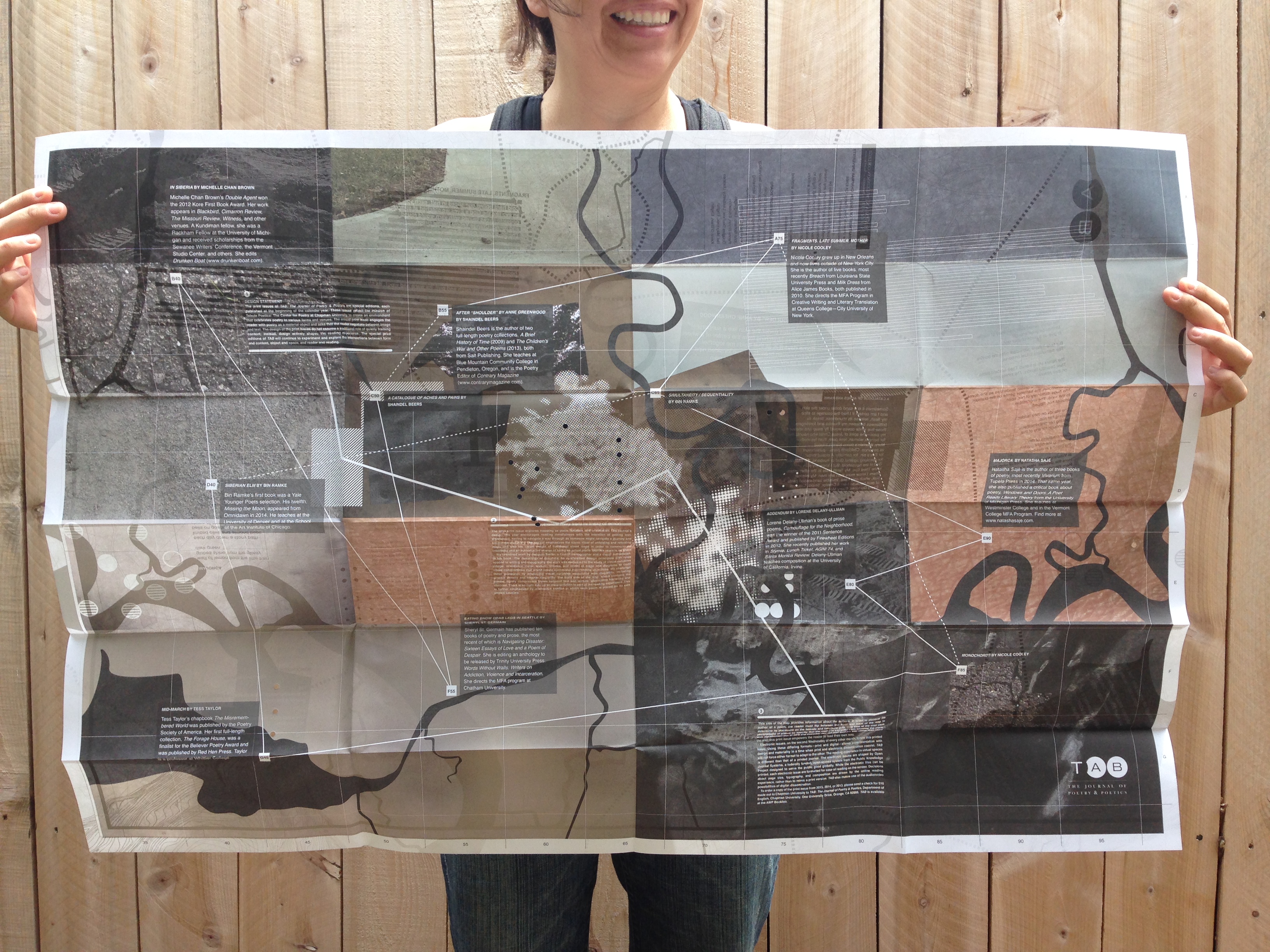
The 2015 print issue explores mapping as place, location, and orientation. The journal’s design this year encourages reading mindfulness with the intention of getting lost, disoriented, having to navigate a way through as someone might navigate a journey and encouraging discovery. The journal emphasizes the iconic ritual of unfolding and refolding maps and also the visual weight of traditional street maps in order to communicate credibility and an authoritative source of being an actual place. But this place is no place.
We examined work by Jacques Bertin, a French cartographer, and a visual semiotician. In his book, The Semiology of Graphics, he synthesized design principles with rules applied to writing and topography. His work was dedicated to the study of visual variables (shape, orientation, color, texture, volume, and scale) of maps and diagrams to code visual combinations that would create successful map-reading objectives. We challenge these guidelines by employing visual variables associated with illegibility, including graphic density and angular illegibility. The front side of the map, which contains the poems, tightly compresses layers between text and texture, eliminating hierarchy and contrast. There is no right side up so disorientation is part of the reading experience. This is further emphasized by orientation conflict in which each poem is placed on its own angled baseline.

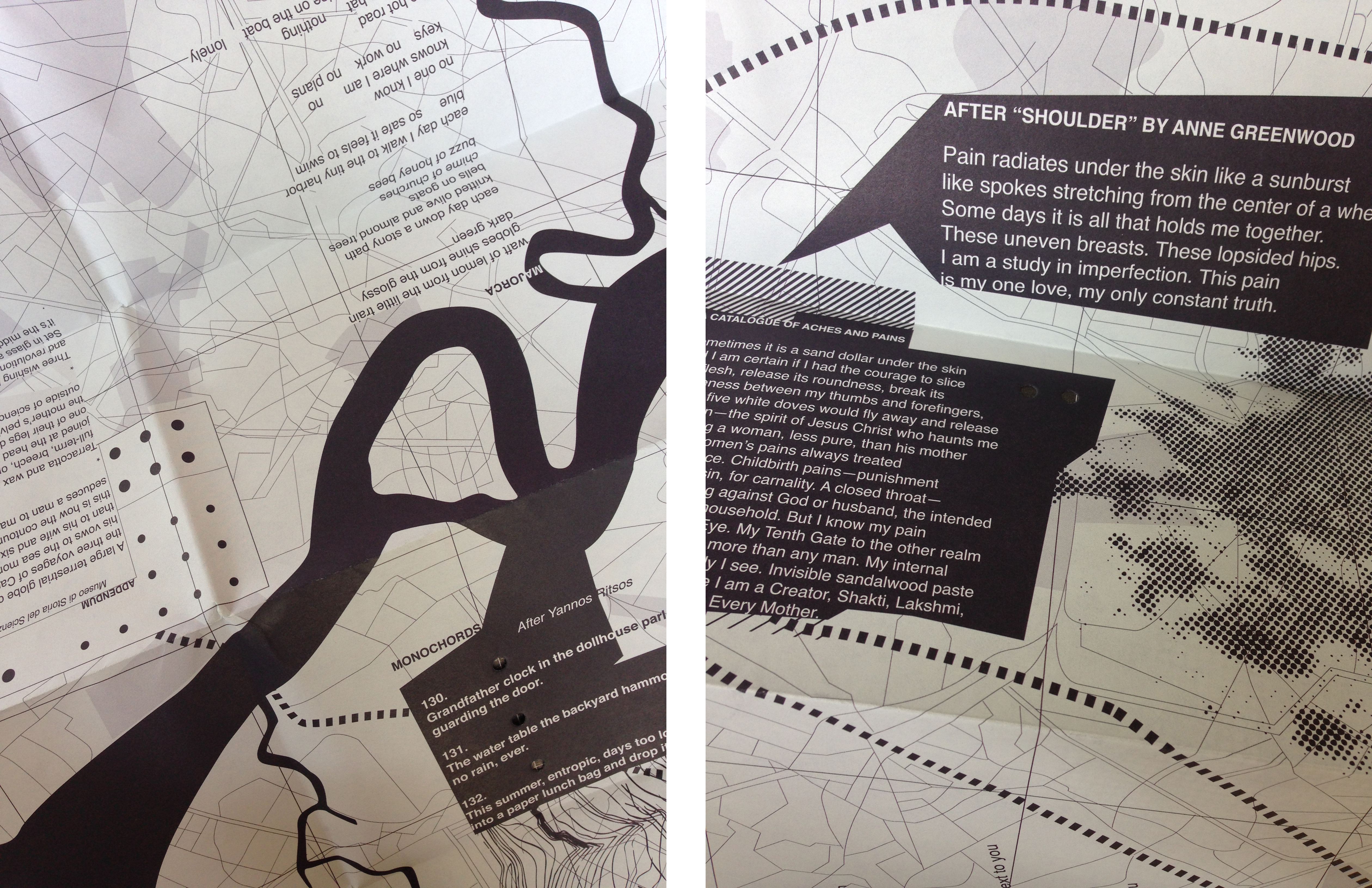
This back side of the map provides information about the authors. In order to discover the author of a poem, the reader must flip between the front and back of the map to determine its placement on the latitude and longitude grid. This side of the map uses photography of places so specific that the reader is excluded from knowing the place. With the common use of GPS and everyday devices that lead the way rather than show the way, this print issue empowers the reader to lead their own way.

Vol. 2 (2014)
The 2014 print issue embodies an expression of time and space. From the beginning of the journal, each page employs atmospheric and, at times, abstract photography of the sky taken at different times of the day. The text has been placed within various objects specifically chosen to interact with light. These objects include water, glass, blinds, wrinkled paper, and windows. The sequence of time is reflected in the progression of the journal, beginning with morning light and moving to nighttime. Experimentation with space is conveyed through the different voices of the authors included in this issue. The issue’s spine is unorthodox, creating unexpected vertical and horizontal movement in the reading experience. The physicality of the object forces the reader to acknowledge its presence. The life of this interactivity becomes an individual journey of pages unwilling to be turned passively. The space in this issue challenges readers to take in more than merely text and image but also a full-body experience of holding and disorientation.

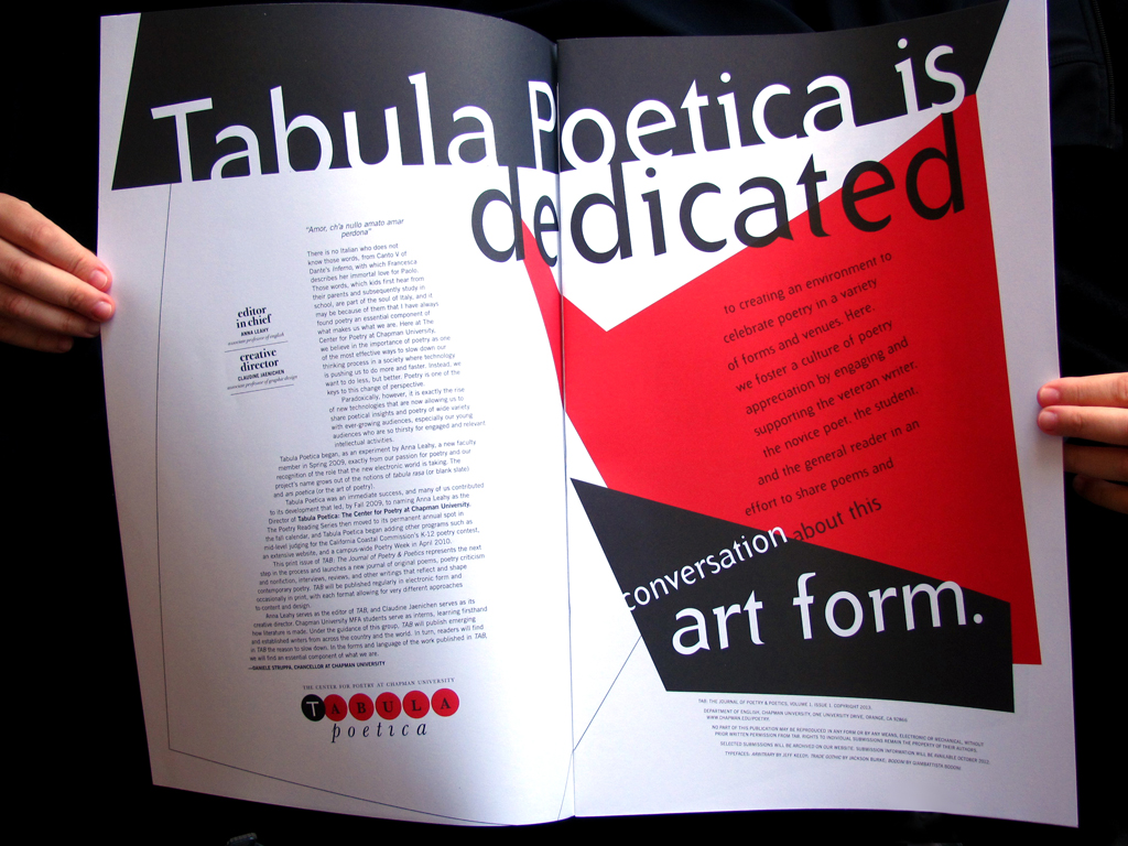
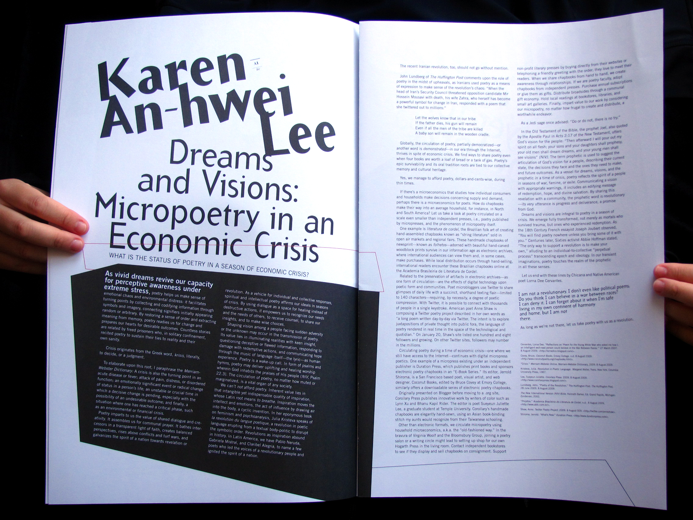
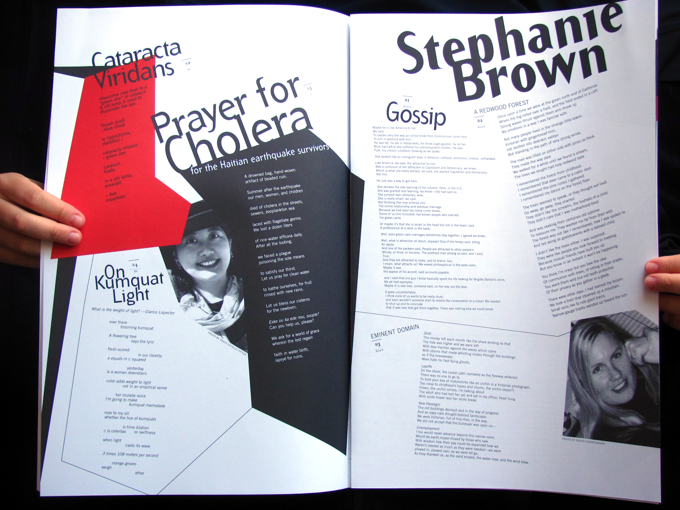
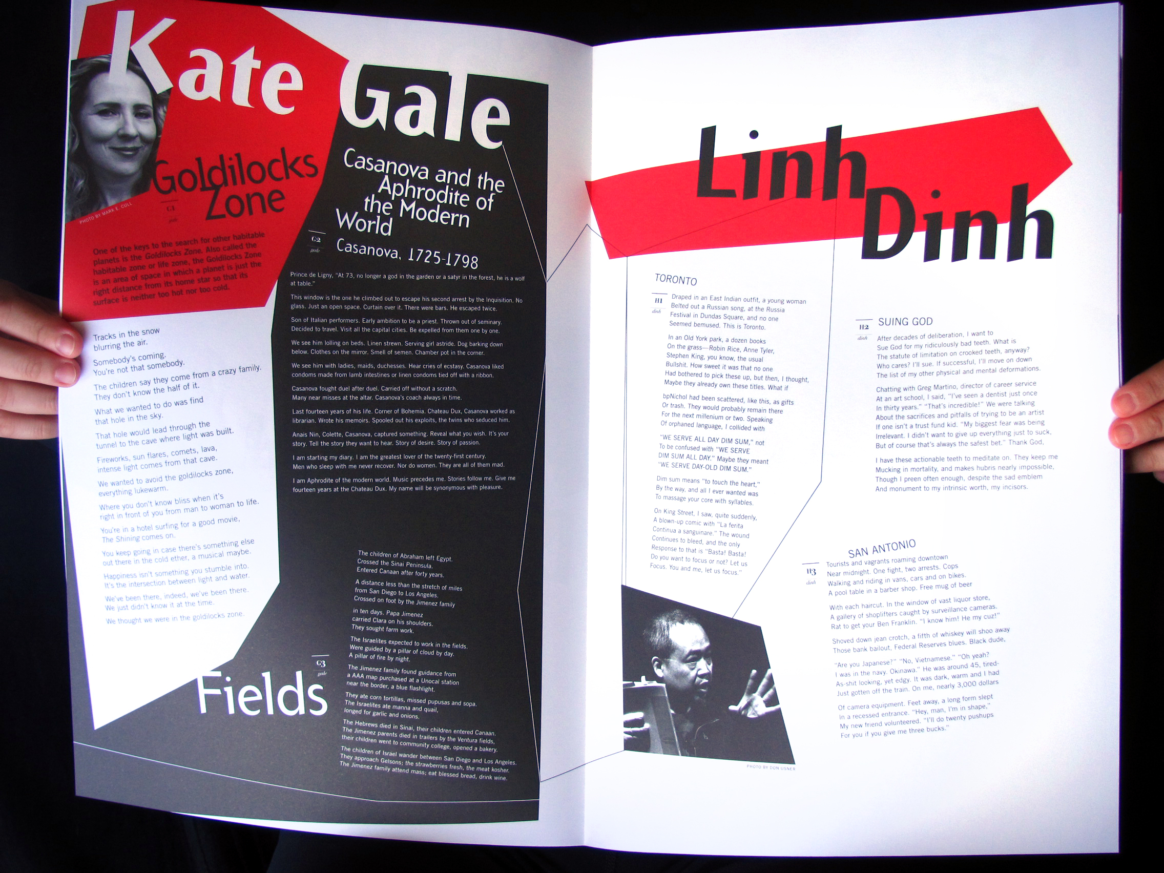
Vol. 1 (2013)
The design of this first issue does not assume a traditional role of quietly framing content; instead, design actively shapes the reading of the entire page. The special print editions of Tab Journal will continue to experiment and explore the intersections between form and content, object and space, and reader and reading.


Quarterly electronic issues follow each annual printed issue. Using these differing formats—print and digital—allows experimentation with design and materiality in a time when print and electronic dissemination coexist. Tab Journal will not force either format to adapt to the other. The reading experience in virtual spaces is different than that of a printed journal. The electronic issues are provided on the Tab Journal‘s website at tabjournal.org. While the electronic files can be printed, each electronic issue will be formatted for ease of reading on the screen. Decisions about page size, typography, and composition are driven by the online reading experience, rather than merely mimicking a print version. Tab Journal also makes use of the audio/video possibilities of digital dissemination.
To order a copy of the print issue, please send a check for $10 made out to Chapman University to Tab: The Journal of Poetry & Poetics, Department of English, Chapman University, One University Drive, Orange, CA 92866. Tab Journal will be available at the AWP book fair.
